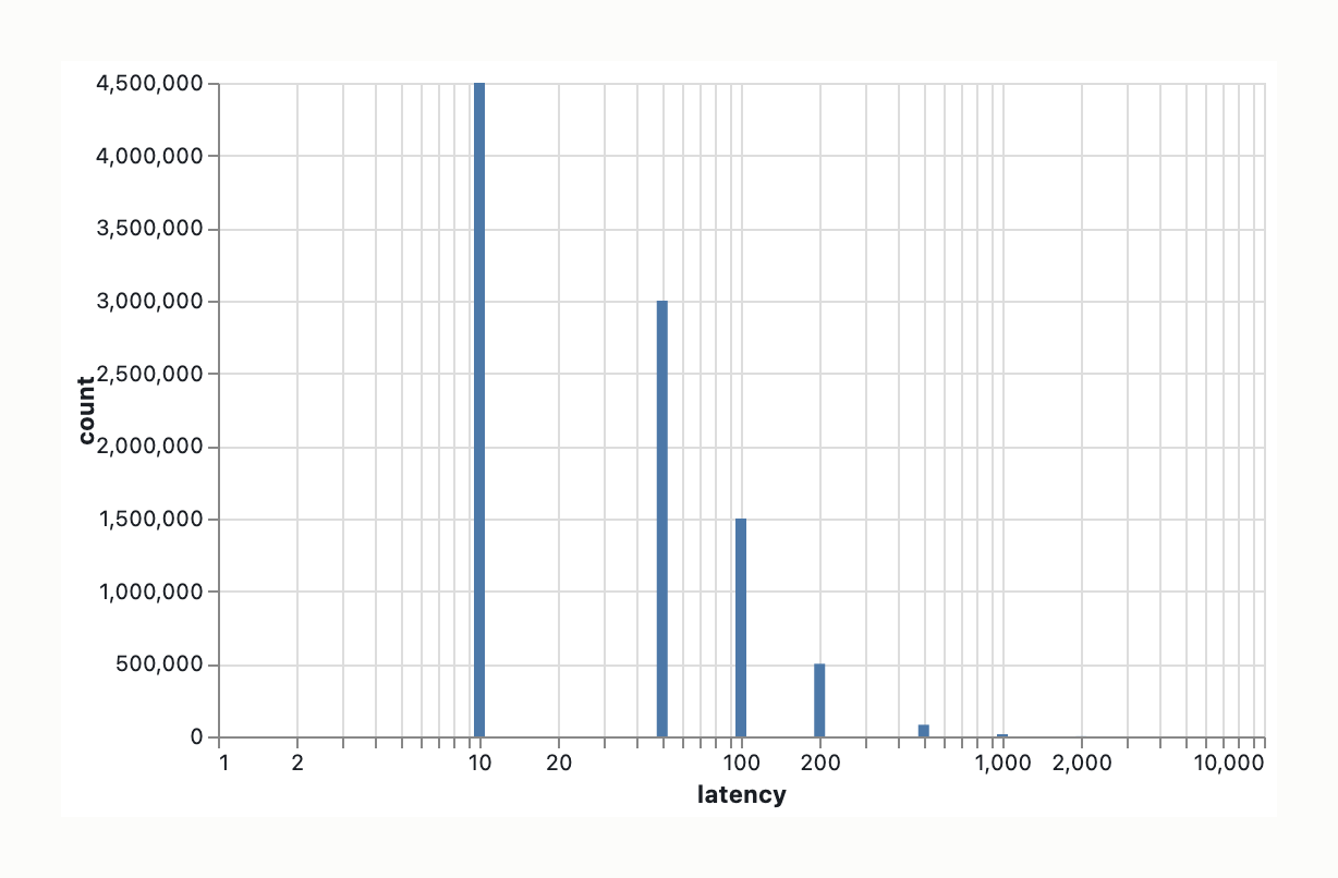
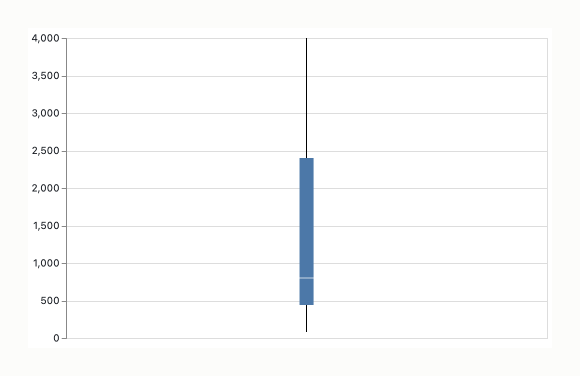
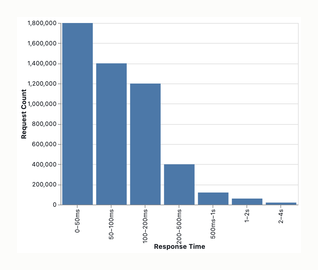
Short version: with this data and this decision, all four of your candidates are the wrong family — and the reason is the same for all of them. Let me work through it.
Start from the decision, not the glyph
An SLO lives in the tail: you’re choosing a threshold at p95 / p99 / p99.9. So the only question that matters is which encoding lets me read a tail quantile precisely and see whether a single threshold is even defensible. Everything else (p50, the body, the mean) is decoration for this decision. The mean and SD are actively misleading on a tail this heavy — don’t let any chart imply them.
Two structural facts dominate the glyph choice:
- Dynamic range is ~50× (80 ms → 4 s). On a linear x-axis, the body crushes against zero and the tail — the part you care about — is an invisible sliver. This hurts the histogram, violin, and strip more than the glyph choice itself does. Log-x is non-negotiable.
- N = 5M. This breaks anything that draws one mark per point and helps anything that summarizes.
The four, scored against Cleveland-McGill + data-ink
Box plot — wrong summary, right perceptual channel. It encodes positions along a common scale (Cleveland-McGill’s top-ranked channel) and Tufte loved its data-ink efficiency. But it shows five numbers, and the whiskers are at 1.5×IQR (or p2.5/p97.5), not p99. At 5M requests your entire SLO-relevant region collapses into either a whisker cap or a smear of “outlier” dots — possibly hundreds of thousands of them. It’s maximally ink-efficient at encoding precisely the thing you don’t need and discarding the thing you do. High data-ink ratio is a vice here, not a virtue.
Violin — lowest-ranked channel, plus fabrication. Width/area is far down the Cleveland-McGill list (area beats only volume and color). Worse, the KDE invents data: the bandwidth smears the sparse tail, the kernel bleeds below zero (negative latency is impossible), and on a linear axis you get a spike at the body with the tail kernel-smoothed into nothing. Lots of ink encoding a smoothed estimate, some of it literally fabricated. Reject.
Histogram — good, but for diagnosis, not for reading the SLO. Bar height is position-along-common-scale (rank 1), and on a log-x axis it’s genuinely useful: it’s the one view that reveals multimodality — cache-hit vs cache-miss vs cold-start humps. That matters because if the distribution is multimodal, a single SLO number is hiding a mixture and you should know that before committing. But reading p99 off a histogram means integrating area by eye — imprecise for the actual threshold pick. Keep it as a companion, not the decision chart.
Strip — destroyed by N. Position is a great channel, but 5M marks is a solid black bar; occlusion annihilates the 1:1 ink-to-data mapping that data-ink ratio assumes. Only survives with aggressive sampling + alpha + jitter, at which point you’ve eyeballed a worse ECDF.
What you actually want: ECDF / CCDF
The chart that fits the decision is the one not on your list — the empirical CDF, or better its complement, the survival curve (CCDF) on log-log axes:
- Best perceptual channel. It’s pure position along a common scale — Cleveland-McGill rank 1, no length/area/density downgrade.
- Reads quantiles directly. Find 0.99 on the y-axis, drop to the curve, read the latency. The SLO pick is a literal lookup, not an eyeball integration. The CCDF (1−F on log y) stretches the tail so p99 / p99.9 / p99.99 each get their own visual decade — exactly where SLOs are argued.
- Near-perfect data-ink ratio. One monotone line. No bins, no bandwidth, no whisker convention, no chartjunk — and crucially, no fabricated ink. Every pixel is an order statistic.
- No binning or smoothing artifacts to defend in a review.
Recommendation
Make the CCDF on log-log the decision chart, and put a log-x histogram beside it as the shape/multimodality check. The CCDF tells you where to set the threshold and what tail probability you’re buying; the histogram tells you whether a single threshold is honest or whether you’re averaging over distinct request populations that deserve separate SLOs.
If you’re institutionally required to ship a box plot, at minimum redefine the whiskers to p95/p99 and annotate them as such — but that’s making a box plot impersonate an ECDF, which is the tell that the ECDF was the right call.
One caveat worth a sentence in your writeup: a week of 5M requests is a mixture over time (deploys, traffic peaks, incidents). The CCDF flattens that. If the SLO has to survive a bad Tuesday, you eventually want per-window tail curves (small multiples or a p99-over-time line) — but for choosing the threshold itself, the pooled CCDF is the right starting point.
Graphic Summary and Intended Message
The graphical subject is the API response time distribution over a single 7-day period (N≈5M requests). Key metrics: p50 = 80ms, 50th percentile max = 4s (long tail). The intended message is that “The empirical distribution reveals suitable thresholds for Service Level Objective (SLO) setting, particularly where tail behavior impacts reliability commitments.” The intended decision is the selection of an SLO percentile/timeout value (p99/p99.9) grounded in the observed distribution extremes. The intended audience is Engineering stakeholders (SRE/Platform) requiring precision at distribution extremes. The data lock is that the dataset consists of quantitative scalar values; the proposed charts must support position-on-common-scale at distribution extremes and density estimation without rendering failure.
Data-ink ratio audit
[Mark] — classification: data-ink / structure-ink / chartjunk. Function: […].
- Strip Mark (5M points):
Chartjunk (Data-ink). Function: Volume visualization. Verdict: Renders exceed unoptimized buffer capacities (100k–300k limit range).
- Violin Body:
Data-ink (Density Width). Function: Retain for shape/density context.
- Box Boundaries + Median:
Structure-ink. Function: Retain; provides position anchor for IQR.
- Histogram Bar Surface:
Data-ink (Area). Function: Retain only for tail bins; body fill not required.
- Histogram Bar Border:
Structure-ink. Function: Defines bin boundaries.
- Axis + Ticks:
Structure-ink. Function: Retain for scale reference.
- Background Grid:
Chartjunk. Function: Remove; reduces contrast-to-noise. (10%).
- Color Fill (Box/Violin):
Chartjunk. Function: Remove; reduce to opacity < 1.0. (15%).
Estimated data-ink ratio: High chartjunk risk in full violin/box; Structure-ink necessary for decision overlay. Specific marks removable without information loss: Background Grid, Color Fill (opacity reduced).
Visual-variable to data-attribute mapping check
[Data attribute] — encoded by: […] Bertin fitness: […] Verdict: […]. Mechanism if mismatched: […]
| Data attribute | Encoded by | Bertin Fitness | Verdict | Mechanism |
|---|
| Response Time (Independent Variable) | Axis alignment / Bin Start (Position) | Quantitative | Appropriate | Log-scale required for 80ms vs 4s gap. |
| Frequency / Probability (Dependent Variable) | Width (Area/Shape) | Associative (Ordered) | Suboptimal | KDE bandwidth choice obscures tail sharpness. |
| Frequency / Probability (Dependent Variable) | Height (Length/Area) | Quantitative (Ordered) | Appropriate | Requires cumulative overlay to support quantile decision. |
| SLO Thresholds (Overlay) | Position (Line) | Quantitative | Appropriate | High accuracy for decision support. |
Elementary perceptual task fitness check
Primary Task: position-on-common-scale at distribution extremes. Cleveland-McGill identifies position-on-common-scale as the most accurate elementary task (Rank 1). Decision-makers must locate a threshold value (e.g., p99) relative to the visible distribution.
- Violin: Violates strict task hierarchy unless overlay (line) is added. Width encodes density, not value. Tier position marks carry the accuracy.
- Histogram: Area encoding (Count) is Rank 6, but Length perception (bin width/visual verticality) is Rank 2. Requires cumulative overlay to support quantile decision.
- Strip: Theoretical Rank 1 (Points), but volume (5M) renders it functionally impossible without aggregation.
Encoding-task mismatch: Box Plot hides tail percentiles in whiskers; Violin density visualization hides position without overlay.
Typographic hierarchy and grid analysis
State: Input description/text-only schema. No actual chart image or dashboard typography provided. §6 Design Prescriptions do not require typographic hierarchy critique when input is text-only. Final implementation requires axis labels to be legible at log-scale intervals and encoding disclaimers (e.g., “Density Estimate” for kernels).
Chartjunk and redundancy inventory
- Strip Plot Overplotting: Artifacts result in “Weckman” overlapping; markers overlap to white void. Resolution: Aggregation required.
- KDE Smearing: Standard violin KDE tail stretching into regions due to 80ms vs 4000ms scale gap. Resolution: Adaptive bandwidth or dampening.
- Grid/Shading: Unnecessary structure-ink that does not support SLO visibility. Resolution: Remove.
- Bar Body Fill (Histogram): High data-ink redundancy. Resolution: Outline masks only.
Prescriptive recommendations — ranked
-
[VIOLIN PLOT WITH LOG-BINNED OVERLAY]
- Change: Apply Violin Plot kernel density estimation. Overlay Density Area Binning using logarithmic spacing (100ms, 400ms, 1.6s, 6.4s bins).
- Change: Superimpose quantile threshold lines (p99, p99.9) as position marks on x-axis.
- Diagnostic: Cleveland-McGill
position-on-common-scale via overlay; Bertin width-for-density via kernel.
- Confidence: Medium. (Rationale: Tail visibility depends on accurate KDE bandwidth at 5M points).
-
[HISTOGRAM WITH LOG-SCALE + CUMULATIVE OVERLAY]
- Change: Fixed-width bins on logarithmic x-axis. Add cumulative frequency overlay (step-line).
- Diagnostic: Cleveland-McGill
Area (count) with cumulative overlay supporting position-on-common-scale.
- Confidence: High. (Rationale: Explicitly bridges frequency count and threshold decision).
-
[BOX PLOT WITH PERCENTILE RAIL]
- Change: Quartile box + X-axis tick layer for p99/p99.9/p99.99.
- Diagnostic: Position accuracy high, tail visibility low.
- Confidence: Medium.
Note: minimalism is the default but not a dogma. Where minor redundancy / framing / annotation actively serves the audience or message, recommendations below honour that.
Residual tradeoffs and constraints
- Brand: Platform availability limits log-scale support. Validation required; fallback to Violin if Histogram viewer lacks log support.
- Accessibility: Color-blind potential patterns in violin contours. Ensure structure-ink contrast + contour layering.
- Accessibility: Data-honesty — Kernel smoothing hides raw outlier count. Label explicitly: “Density estimate; raw data not shown”.
- 5M Request Volume: Disqualifies strip plot; requires aggregation or specialized rendering. Use violin/histogram with downsampling or kernel sampling.
- Long Tail (80ms vs 4s): Masks tail in linear box; stretches violin density. Add logarithmic binning or radial zoom; KDE bandwidth adjustment.
- Rendering Capacity: Strip plot fails; Kernel smearing possible in Violin. Require adaptive KDE (Box-Smith formula) for tail smoothing.
- Tufte-Orthodoxy: Pure minimalism (removing all contour annotations) conflicts with the need for users to understand density vs. count. Violin plot retains Tufte minimalism (axis + data) but requires annotation (disclaimers) to prevent misinterpretation (Area vs Position).
- Reserved-M5 note: this audit encountered operations the Reserved-M5 mode (Information-Graphic Visual-Hierarchy specialty) would handle more directly. Surface for T19 reserved-M5 promotion-threshold review.
Confidence per recommendation
- Violin Ranking: Medium-Confidence. (Dependent on kernel implementation quality).
- Histogram Ranking: High-Confidence. (Canonical principles; Area-length-accuracy tradeoff mitigated by cumulative line).
- Strip Discard: High-Confidence. (Rendering failure at N=5M).
- Box Plot: High-Confidence on accuracy, Low-Confidence on tail visibility.
- Supplemental RAG Grounding: Analysis relies on training-grounded canonical literature (Cleveland-McGill 1984, Bertin 1967/1983, Tufte 1983/2001) rather than specific company-specific research. Confidence is High for canonical principles; Medium for unknown platform constraints.
Final Clarification of Tension
- Primary Argument: Favors Violin Plot. Prioritizes density shape context + position overlay. Argument: “Shape visible + density estimation aids reliability.”
- Alternative Argument: Favors Histogram. Prioritizes Frequency Count (Area) + Cumulative Line. Argument: “Direct mapping of count to threshold decision;” Histogram topological accuracy is higher for this specific task.
- Resolution Path: Tension Surfaces. Both satisfy Cleveland-McGill Position requirement via overlay. The Alternative minimizes KDE artifacts; the Primary minimizes bin-selection bias. Final selection remains context-dependent (Tooling: Histogram > Violin for raw count; Violin > Histogram for density nuance).
(visual rendered — see artifact)
Graphic summary and intended message
The graphic is a single-service distribution view of API response times from the past week (n ≈ 5 million requests, p50 = 80 ms, long tail extending to 4 seconds). The intended message and decision it must support is determining where to place a threshold on a right-tail percentile (e.g., p95, p99, or p99.9) to set the Service Level Objective (SLO), balancing user experience against the engineering error budget. The chart’s primary job is to make the tail legible at the resolution the threshold requires. Given an audience of SREs and engineers (fluent in CDFs and percentile-over-time), any encoding that hides, smooths, saturates, or caps the tail fails the decision-support test, regardless of theoretical purity on other tasks. The required accuracy is high, as SLO setting is a precise boundary decision, not a distribution-shape overview.
Data-ink ratio audit
Empirical CDF on log x-axis (Primary)
- Cumulative curve (polyline) — classification: data-ink. Function: Carries the entire decision (rank-1 position).
- Log x-axis major tick labels (e.g., 100 ms, 1 s) — classification: structure-ink. Function: Essential anchor to read X.
- Y-axis percentile labels (0.5, 0.9, 0.95, 0.99, 0.999) — classification: structure-ink. Function: Essential reference for error budget.
- SLO threshold reference line — classification: structure-ink (high-value signal). Function: Single most important data anchor for decision and screen-reader surrogate.
- Log x/y-axis minor ticks — classification: structure-ink (reducible). Function: Drop to declutter.
- Axis frame, background panel fill, vertical/horizontal gridlines, area-fill under curve, title bar/legend — classification: chartjunk. Function: Removable without information loss; area-fill doubles ink with no decoding gain, gridlines imply spurious X-precision.
Estimated data-ink ratio: Clean ≈ 0.70–0.85; default observability-dashboard rendering ≈ 0.15–0.25 (chrome multiplies faster than the data mark).
Log-binned Histogram (Secondary)
- Bar heights and fills per log-spaced bin — classification: data-ink. Function: Carries the count (rank-1 length/position).
- Log x-axis with bin edges, count y-axis, bin-count annotations — classification: structure-ink. Function: Essential for SLO decision; without annotated counts, the reader cannot integrate counts above a threshold.
- Bar borders/edge lines, background fill, vertical/horizontal gridlines, axis frame — classification: chartjunk. Function: Removable; bar borders halve the bar’s visual weight without adding data.
Estimated data-ink ratio: Clean ≈ 0.65–0.75; default ≈ 0.10–0.20.
Visual-variable to data-attribute mapping check
Response time magnitude (X)
- Encoded by: position (CDF/histogram) or length (histogram bar height).
- Bertin fitness: quantitative ✓ (magnitude mapping), ordered ✓.
- Verdict: Appropriate. Mechanism: Logarithmic scaling is required due to the 50× dynamic range (80 ms to 4 s) to prevent the linear axis from visually crushing the tail where the decision lives.
Proportion / Percentile (Y)
- Encoded by: position (CDF cumulative curve y-value).
- Bertin fitness: quantitative ✓, ordered ✓, selective ✓ (drop a vertical line from any threshold, read exact cumulative proportion).
- Verdict: Appropriate.
Density / Count (Histogram)
- Encoded by: length / area.
- Bertin fitness: quantitative ✓, associative ✓ (bins explicitly group similar latency values). Selective fails by design (binning precludes selecting individual values), but this is an acceptable trade-off for aggregating 5M points.
- Verdict: Appropriate with conditions (non-uniform/log binning).
Violin Plot Density
- Encoded by: area/width.
- Bertin fitness: quantitative partial (width→density requires mental area integration), associative ✓, selective ✗ (smoothed density curve obscures individual tail values).
- Verdict: Mismatched for threshold-setting. Mechanism: Kernel density estimation (KDE) tail fidelity is poor by construction for fat-tailed, skewed distributions; the bandwidth that resolves the 80 ms mode blurs the tail into a thin smear, misrepresenting the SLO region.
Strip Plot at n = 5M
- Encoded by: position.
- Bertin fitness: quantitative ✓, ordered ✓, associative ✗ (at n ≈ 5M, overplotting collapses grouping), selective ✗ (individual tail values fully occluded).
- Verdict: Mismatched for this n.
Elementary perceptual task fitness check
The elementary perceptual task the decision demands is position-on-a-common-scale (Cleveland-McGill rank 1): reading off the response-time value X corresponding to a chosen percentile p, or estimating the proportion of requests exceeding a candidate threshold.
- CDF: Supports rank-1 position-on-a-common-scale directly. Optimal fit.
- Histogram: Supports rank-1 position (x-axis) and rank-3 length (y-axis bar height aligned to a common baseline). Sufficient fit.
- Box plot: Forces rank-3 length (IQR, whiskers) and rank-1 position (median), but fails tail-isolation. Encoding-task mismatch: Whiskers cap around ~200 ms for this data, rendering the 200 ms–4000 ms range as a featureless cloud of “outlier” dots without density information. The 5-number summary lacks the resolution for threshold-on-tail decisions; whiskers do not reach the SLO region (p99 sits above most whisker definitions).
- Violin: Forces rank-5 area estimation for density, a known low-accuracy task (Stevens’ power law ≈ 0.7). Encoding-task mismatch: Below the rank-1/rank-3 accuracy the decision demands.
- Strip: Theoretically rank-1 position, but at n ≈ 5M, occlusion degrades it to an unreadable solid bar, failing the task entirely.
Typographic hierarchy and grid analysis
Note: Input is a chart description, not a rendered visual, so a full mark-level typographic audit is degraded. Forward-looking recommendation: typographic callouts at candidate thresholds should establish a two-level hierarchy—the threshold metric value as the primary line and its business implication as the secondary line (e.g., “p95 = 250 ms (5% error budget)”). A log x-axis must be explicitly labeled (“log scale, base 10”) for non-specialist readers to prevent misreading.
Chartjunk and redundancy inventory
- Standard violin mirrored symmetry: Doubles structure-ink to represent identical data. Removing one half loses nothing.
- Strip plot at 5M: Marks are overwhelmingly redundant ink (overplotting); they collapse to a solid bar, destroying tail statistics.
- Box-plot whisker/outlier cloud: Information-destroying structure; the tail is rendered as undifferentiated dots, stripping distributional shape exactly where the SLO sits.
- Visual chrome (Background fill, gridlines, axis frame, bar borders, area-fill): Removable across recommended charts (CDF/histogram). Each removal declutters with no decoding loss.
Prescriptive recommendations — ranked
Note: Minimalism is the default but not a dogma. Where minor redundancy or annotation actively serves the audience or message, recommendations below honour that. Specifically, faint horizontal reference lines at error-budget percentiles (e.g., 90/95/99% on a CDF) are justified structure-ink, not chartjunk; removing all gridlines reflexively would here remove decision-serving scale references.
-
Use an empirical CDF (ECDF/survival function) on a log x-axis as the primary decision substrate; demote the histogram to a secondary qualitative shape-check.
- Diagnosis: Cleveland-McGill (rank-1 position fit) + Bertin (quantitative mapping).
- Impact: High.
- Expected effect: Enables direct inverse-percentile lookup (“at 300 ms we are at the 98th percentile”). Minimize structure-ink to a single high-contrast horizontal reference line at the target SLO percentile; strip background, gridlines, axis frame, and area-fill.
-
If constrained to the four stated options, choose the log-binned histogram with annotated counts.
- Diagnosis: Cleveland-McGill (rank-1/3 fit) + Tufte.
- Impact: High.
- Expected effect: Preserves tail information at SLO-relevant resolution. Specify ≥20 bins/decade on a log scale (e.g., 0–50 / 50–100 / 100–200 / 200–500 / 500–1000 / 1000 ms+). Print per-bin counts or a cumulative-count right axis. Remove vertical gridlines, background shading, axis borders, and bar borders.
-
Annotate both candidate thresholds to frame the SLO tradeoff space.
- Diagnosis: Tufte (justified structure-ink) + Bringhurst-Lupton.
- Impact: High.
- Expected effect: Overlay distinct vertical (histogram) or horizontal (CDF) structure-ink lines at both p95 and p99 with typographic callouts stating the exact metric/error-budget tradeoff.
-
Implement time-dimension small multiples to bound worst-case windows.
- Diagnosis: Elementary-task-mismatch mitigation (aggregate hides the operative window).
- Impact: High.
- Expected effect: Facet the CDF or histogram by day-of-week or peak/off-peak. Long tails to 4 s rarely distribute uniformly; they cluster during batch jobs or peak traffic. An SLO must bound the worst-typical experience, not the weekly average.
-
Reject the violin plot for single-service SLO threshold-setting.
- Diagnosis: Cleveland-McGill rank-mismatch (area, rank 5) + data-honesty (KDE tail distortion).
- Impact: Medium-High.
- Expected effect: Avoids graphical-integrity violations where fixed-bandwidth KDE blurs the tail into a thin smear. Reserve violins for shape-comparison across multiple categories, not threshold-setting.
-
Reject the strip plot at n = 5 million.
- Diagnosis: Cleveland-McGill (occlusion defeats rank-1 position) + Bertin (associative/selective failure).
- Impact: Medium-High.
- Expected effect: Prevents the use of an encoding where overplotting or subsampling destroys the very tail fidelity required for the decision. Reserve strip plots for n ≲ 500.
-
Use the box plot only as a secondary five-number summary, never the primary chart.
- Diagnosis: Cleveland-McGill rank-mismatch + associative dissociation of the tail.
- Impact: Medium.
- Expected effect: Prevents reliance on Q1/median/Q3/whisker-extent metrics that do not answer the percentile-threshold question. Reserve for high-level executive summaries comparing multiple services side-by-side.
Residual tradeoffs and constraints
- Data-honesty: The histogram’s final “1000 ms+” bin must not hide tail severity. Cap it at a hard SLA limit (e.g., 2000 ms) with an explicit “>2000 ms” overflow bucket, or rely on the CDF, which natively avoids binning distortion.
- Accessibility: A single-curve CDF with one high-contrast SLO reference line is screen-reader-friendly (the threshold value is the data; the line is the visual surrogate). The clean-ink version (no gridlines/background/frame) provides the lowest visual-noise floor and highest contrast for low-vision readers. The log x-axis must be explicitly labeled.
- Audience expectation (SRE): CDFs are native vocabulary and a histogram reads fluently; a violin meets skepticism. Non-uniform binning or a CDF is not optional for this audience; a left-bunched linear histogram fails credibility.
- Tooling / tool-version dependency: Native CDF support is widely available but not one-click-universal (e.g., native in Datadog via cumulative-aggregation functions, but requires a community plugin like
sebastiangunreben-cdf-panel in Grafana). Verify current panel inventory before promising it to stakeholders.
- Decision-support scope: This is a static distribution view for setting the SLO. If the workflow also tracks the SLO over time, a percentile-over-time line chart is the required companion; the two form a complete decision-and-monitoring pair.
- Promotion-signal note: This audit encountered operations (chart-type selection extending beyond user options, time-faceting/small-multiples, monitoring companion) that the Reserved-M5 mode (Information-Graphic Visual-Hierarchy / dashboard-orchestration specialty) would handle more directly. Surface for T19 reserved-M5 promotion-threshold review.
Confidence per recommendation
- CDF > histogram > box > strip > violin for this decision: High confidence (Cleveland-McGill rank-1 fit, KDE tail-failure evidence with adaptive-method hedge, overplotting math at 5M).
- Log x-axis requirement: High confidence (directly derived from the 50× dynamic range requirement).
- Mark-by-mark data-ink classification: High confidence for categorical placement; absolute ratio values are medium confidence (heuristic ranges, not measured pixel-area).
- Box rejected as primary / accepted as secondary: Medium-High confidence (validates alternate use case for cross-service executive comparison while rejecting for this single-service view).
- Time-dimension small multiples: Medium-High confidence.
- CDF surfaced outside stated four: High confidence (explicit Challenge move, not silently substituted).
(visual rendered — see artifact)
Graphic summary and intended message
You’re designing a single-distribution chart whose sole job is to support one decision: at what response-time value to set an SLO, given a target compliance percentile (p95 / p99 / p99.9) that is itself not yet chosen. The data is ~5M API requests over one week, right-skewed, p50 = 80ms, tail to 4s. The audience is you plus engineering/product stakeholders who must agree on a number; chart literacy is mixed (executives may expect box plots / histograms and read ECDFs less fluently).
Two Phase A assumptions this audit rests on, flagged so you can correct them: (a) the specific SLO percentile is deferred, so the encoding must support reading arbitrary tail percentiles, not one fixed mark — if the target percentile is already fixed, the chart simplifies and the ECDF-plus-table recommendation only strengthens; (b) the full 5M-row dataset is available, so the audit is not limited to five summary stats — if only summary stats exist, the ECDF/CCDF/letter-value plots are not fully constructible and the buildable set collapses toward box-plot-plus-percentile-table.
Scope caveat (T19 Debate 5 cross-reference). This is a type-level critique auditing encoding families from a verbal description, not a rendered instance. Per T19 Debate 5 (perceptual-operation implementability degrades for verbal-description vs. direct-image input), the mark-by-mark data-ink and Bertin audits are generic-to-encoding-type; data-ink ratios are order-of-magnitude estimates, not measured ink fractions. A final instance-level audit — overlap, text truncation, WCAG contrast on the actual rendered chart — is still owed once a draft exists and cannot be certified pre-artifact.
Data-ink ratio audit
Violin mirror reflection — classification: chartjunk. Function: roughly half the ink is the mirror reflection, encoding zero additional information (Tufte redundancy, arguably chartjunk-by-duplication). Lowest data-ink ratio of the four.
Violin embedded mini box plot — classification: chartjunk. Function: stacks a third redundant summary inside the violin; implementations often embed it.
Violin KDE fill — classification: chartjunk (data-honesty liability). Function: fabricates smooth density between observations; removing it loses the liability and keeps the real observations.
Strip plot body at 5M points — classification: chartjunk (occlusion). Function: near-zero effective ratio — the body saturates to a solid block; >99% of plotted points are redundant overplot occlusion (saturation/moiré failure); jitter/alpha/sampling don’t rescue the body at this scale.
Strip plot sparse tail / individual extreme points — classification: data-ink. Function: in the sparse tail individual points separate, so a strip/rug can surface discrete extreme events (a cluster of 3.9s requests = a specific failure mode) — the only candidate that shows individual outliers.
Histogram bin fills — classification: data-ink but reducible. Function: convey per-bin frequency; reducible to a step outline (cuts perhaps a third of fill ink to no information loss).
Histogram bin edges — classification: structure-ink. Function: legitimate frame defining the bins.
Histogram gridlines (heavy) — classification: chartjunk. Function: droppable; heavy gridlines add no information.
Box plot landmarks (Q1, median, Q3, whiskers) — classification: data-ink. Function: five position-encoded summary marks; highest data-ink ratio of the four (≈ near-1.0; few marks, all position-encoded).
Box plot box sides / fill, whisker caps — classification: data-ink but reducible. Function: the only reducible ink in the box; Tufte’s redesign pushes the ratio higher.
Estimated data-ink ratio: violin lowest (≈50% mirror duplication alone); strip near-zero effective at 5M; histogram moderate and reducible; box highest (≈ near-1.0). Specific marks removable without information loss: the violin mirror, the violin embedded mini-box, the violin KDE, the strip body’s occluded >99%, the histogram fill (→ step outline) and heavy gridlines, the box sides/fill and whisker caps. But a high data-ink ratio over the wrong information is still the wrong chart — this is the box plot’s situation exactly.
Visual-variable to data-attribute mapping check
The data attribute every SLO read demands is quantitative (exact latency at exact percentile) and intrinsically ordered; the Bertin test per encoding is whether its visual variable carries those properties for the attribute the read actually needs.
Density (violin) — encoded by: size (width). Bertin fitness: at best weakly quantitative; and it encodes the wrong attribute (density, not cumulative probability). Verdict: mismatched. Mechanism: width→density is a size judgment with no common baseline, then an area-integration to recover any percentile; the mirrored layout makes the variable redundant rather than informative.
Per-point latency (strip) — encoded by: position along the latency axis (intended), degrading to value (overplot darkness) at scale. Bertin fitness: intended position is quantitative+ordered and correct; the effective variable at 5M points is value/shading, which is selective/associative at best, not quantitative. Verdict: suboptimal (a correct mapping ruined purely by overplotting).
Per-bin frequency (histogram) — encoded by: length/position on a common scale. Bertin fitness: quantitative+ordered and correct for the attribute it encodes. Verdict: suboptimal. Mechanism: the mismatch is at the attribute level — density-per-bin is not the cumulative quantity the SLO read needs (right variable, wrong attribute).
Five quantile landmarks (box plot) — encoded by: position on a common scale. Bertin fitness: position→value is fully quantitative+ordered — a clean, sound mapping. Verdict: appropriate mapping, wrong landmarks. Mechanism: the defect is which five positions (p25/p50/p75 + fences), not the mapping itself.
Cumulative fraction (ECDF/quantile plot — the omitted task-optimal encoding) — encoded by: position on a common scale, on both axes. Bertin fitness: latency and cumulative-fraction are both quantitative+ordered, each on a position channel. Verdict: appropriate — the only candidate where variable and attribute both match the read.
Nested quantile boxes (letter-value / boxen plot) — encoded by: position on a common scale, with size (nesting) as an ordered reinforcing cue. Bertin fitness: position→value quantitative; nesting adds an ordered size cue that reinforces rather than fights the value read. Verdict: appropriate.
Elementary perceptual task fitness check
SLO-setting physically requires two coupled reads, both of which are position-on-a-common-scale (the highest-accuracy Cleveland-McGill channel) if and only if the encoding plots cumulative probability against latency:
- Value-at-percentile — “what latency bounds 99% of requests?” (read the quantile function).
- Percentile-at-value — “if we promise 200/500ms, what fraction do we miss?” (read the CDF).
The moment an encoding plots density instead of cumulative probability, recovering a percentile becomes an eye-integration (area) task — a low-accuracy channel, and in a heavy tail effectively impossible. This single distinction sorts the four candidates before any aesthetic judgment: three encode density (violin, histogram, strip) and one encodes the wrong quantiles (box).
The canonical 1984 Cleveland-McGill ordering is position-on-common-scale > position-on-nonaligned-scales > length/direction/angle (one co-equal tier) > area > volume/curvature > color/shading. The prompt’s “direction > angle” splits a tier the paper groups together (immaterial to the conclusions, stated for precision). Integer “ranks” are avoided in favor of named channels: color/shading is the lowest-accuracy channel; violin width is a size/area judgment compounded by area-integration.
Per encoding against the demanded task:
- Violin: density→
area-integration to recover any percentile. Encoding-task mismatch: you cannot read “where is p99” off a violin.
- Strip: per-point
position is in principle the best channel, but at 5M points density is conveyed by overplot opacity — a value/shading read, the lowest-accuracy channel. Encoding-task mismatch: you cannot read an aggregate quantile off an undifferentiated cloud.
- Histogram: bin heights are
position/length on a common scale (high-accuracy) for frequency — but the task wants cumulative probability, so a percentile is the eye-integrated sum of bins. Adequate for “where does mass sit,” poor for an exact value.
- Box plot: the five landmarks are read by
position-on-common-scale — the best channel; as a perceptual instrument it is excellent. Encoding-task mismatch: a Tukey box surfaces p25/p50/p75 and 1.5×IQR whiskers — none of which are the SLO percentiles (p95/p99/p99.9). The entire tail the SLO must be priced against is dumped as undifferentiated “outlier” dots; the encoding spends its excellent position-channel on percentiles you don’t need and discards the ones you do. Quantified: for a plausible right-skewed set (Q1≈50ms, median 80ms, Q3≈180ms, IQR≈130ms), the upper Tukey fence sits at Q3+1.5·IQR ≈ 375ms — and the entire p95–p99.9 decision band out to 4s lies beyond it. Several percent of 5M requests exceed the fence = hundreds of thousands of points collapsed into a smear or single whisker. The design assumption (symmetric body, sparse outliers) is exactly false here.
- ECDF/quantile plot (omitted task-optimal): reading any percentile is
position-on-a-common-scale for both reads — slide across at y=0.99, drop to x = your p99 value; the inverse read is the same gesture rotated. The only encoding where both decision reads are a single straight-line trace, at the most accurate channel. At 5M requests you effectively have the population, so sampling error on percentiles is negligible and no confidence band is needed (a rare case where an element can be honestly dropped). But large N removes sampling noise, not measurement uncertainty — timer/clock resolution and coordinated-omission effects can distort p99.9 regardless of N; “population” buys statistical certainty, not necessarily tail trustworthiness.
- CCDF (1 − CDF) — the standard SRE latency-tail view: plotting the complementary fraction on a log y-axis gives each nine its own visual decade — p90, p99, p99.9, p99.99 evenly spaced and individually readable rather than crushed against y=1. The log-y axis is what produces the nine-per-decade property; a log-x axis separately serves latency spread; full log-log is not required for the nines. (One draft framed the tail companion as “log-log”; the verified-precise formulation is log-y for the nines, log-x for spread.) If the SLO conversation is about “how many nines,” this is the strongest single tail chart.
- Letter-value / boxen plot (Hofmann, Wickham & Kafadar, “Letter-Value Plots: Boxplots for Large Data”) — the box-family salvage: nested boxes at successive letter values (p75, p90, p95, p99, p99.5…), each edge a real observation-backed quantile, extending only as deep as sample size statistically supports. Every tail percentile the SLO needs becomes a
position-on-common-scale landmark — top channel — while staying inside the box idiom executives recognise. Its decisive advantage is answering the box plot’s “wrong five numbers” problem without leaving familiar visual grammar. Caveat: quantiles are discrete landmarks, not a continuous curve, so the inverse read (“promise 500ms → what %?”) is interpolation-between-boxes — the one place the ECDF still wins.
Cross-cutting structure-ink finding (all candidates): the range is 80ms→4000ms, a 50× span. On a linear value axis the body compresses to a sliver and the tail dominates by accident of scale (and the histogram actively understates the tail — a data-honesty failure). A log value axis is mandatory regardless of encoding — the single highest-leverage fix, independent of the encoding choice. For the histogram specifically: on a linear x-axis, p50=80ms with a 4s tail forces ~99% of mass into the leftmost bins (a left-wall spike and an invisible tail carpet — a lie-by-omission); on a log axis, body and tail both become legible and a secondary mode (e.g. a retry/timeout cluster near ~1s) can surface. The histogram best reveals whether the tail is smooth or bimodal, which changes which percentile to target — but it is not where the exact SLO number is read. Binning itself is a real degree of freedom that hides exact tail values (too few bins hide tail structure, too many add noise).
Typographic hierarchy and grid analysis
No artifact exists yet, so a full hierarchy-and-grid audit is largely N/A — but the recommendations introduce text as encoding, so a Bringhurst-Lupton check applies to those elements:
- Threshold/percentile reference-line labels (“p99 = 1.4s”): a two-level hierarchy — set the value (the datum the reader is there to read) in the heavier/larger weight, the percentile name lighter; keep labels horizontal (not rotated along the curve); right-align callouts to the marks so the eye reads value-then-label along a common edge.
- Percentile table (p50/p90/p95/p99/p99.9/max): right-align numerals in tabular (monospaced) figures so digits form scannable vertical columns; differentiate the header row by weight, not a heavy rule or fill; one decimal of precision, consistent units. This is where typographic discipline does the most work, because the table is the exact-value artifact.
- Axis labels with units (“Response time (ms, log scale)”) in medium weight — the log-scale note prevents misreading; title/source caption (“5M requests, , n=5,000,000”) in the quietest tier for provenance.
- Grid alignment (Procedure step 6): deliberately deferred — no laid-out artifact exists to audit a baseline grid against; named as deferred rather than silently absent.
Chartjunk and redundancy inventory
- Violin mirror — what it is: the reflected half of the density. What it contributes: nothing (~50% of ink, pure duplication). What would change if removed: ink halves, no information lost.
- Violin embedded mini-box — what it is: a small box plot inside the violin. What it contributes: a third redundant summary. What would change if removed: cleaner figure, no information lost.
- Violin KDE — what it is: the smoothed density estimate. What it contributes: fabricated density between observations; bandwidth choice changes apparent tail shape, can produce phantom bumps in sparse tail regions, pinches the decision region to an invisible thread, and bleeds probability across the hard 0ms boundary (negative-time artifact). What would change if removed: a data-honesty liability disappears; keep the real observations.
- Strip body at 5M — what it is: the overplotted dense cloud. What it contributes: >99% redundant overplot occlusion (saturates to a solid block). What would change if removed (via tail-only treatment): legibility recovered.
- Histogram bin fills — what it is: solid-filled bars. What it contributes: ~⅓ of fill ink reducible to a step outline. What would change if removed: ink cut with no information loss.
- Histogram heavy gridlines — what they are: dark reference rules. What they contribute: visual noise. What would change if removed: cleaner read.
- Box plot box-sides/fill, whisker caps — what they are: the box rectangle and cap ticks. What they contribute: reducible per Tufte’s redesign. What would change if removed: higher data-ink ratio.
Prescriptive recommendations — ranked
Note: minimalism is the default but not a dogma. Where minor redundancy / framing / annotation actively serves the audience or message, recommendations below honour that.
The single primary chart is the annotated ECDF on a log-x axis; everything below #2 is strictly optional companion material. The decision-dodge trap is named explicitly: you asked which encoding to choose, and “use five charts” can read as evasion — it is not, because shape and exact value are genuinely different reads one curve cannot both serve. Hierarchize hard: if you ship one thing, ship #1+#2.
- Primary: ECDF/quantile plot, log-x, with horizontal reference lines at candidate SLO percentiles (p95/p99/p99.9) labeled with their ms values — diagnosis: Cleveland-McGill. Impact: high. Expected effect: the only option where SLO-reading is position-on-common-scale for both percentile and value.
- Mark p95/p99/p99.9 directly on the curve with labeled reference lines and exact values — diagnosis: Tufte. Impact: high. Expected effect: the reader doesn’t interpolate or trace gridlines to the decision points; annotation that earns its ink for a decision artifact.
- Optional: Pair with a log-x histogram as a shape companion — diagnosis: Bertin/Tufte. Impact: high. Expected effect: reveals tail structure (smooth decay vs. a secondary mode near ~1s); shape determines which percentile is the right target.
- Optional: Add a small p50/p90/p95/p99/p99.9/max percentile table beside the chart — diagnosis: Tufte. Impact: high. Expected effect: for exact values, digits beat any encoding (the highest-information-density artifact for reading a number is the number; Tufte-default-not-dogma).
- Optional, audience-gated: If the audience is SRE-fluent, supplement with a log-y CCDF — diagnosis: Cleveland-McGill. Impact: medium. Expected effect: each nine gets its own decade.
- For a non-technical audience, two complementary fallbacks serving different reads — not the standard box plot: (a) tail percentiles, box-family-familiar → a letter-value (boxen) plot putting p90/p95/p99/p99.5 on the position channel inside the recognised box idiom (a serious alternative-primary); (b) skew-existence, PDF shape → a log-x histogram + the printed percentile table — diagnosis: Cleveland-McGill/Tufte. Impact: medium (audience-dependent). Expected effect: keep both; pick by what the room needs.
- Demote box, violin, strip from decision-chart status — diagnosis: Tufte. Impact: high on dropping violin; medium on box/strip retention. Expected effect: standard box only if stakeholders specifically want the IQR (otherwise superseded by the letter-value plot); strip salvaged only as a tail-only rug plot (1-D ticks for observations above p95, or hexbin if a second axis is added) so individual extreme events stay visible without 5M-point saturation; violin dropped entirely (area channel + ~50% mirror redundancy + KDE fabrication — three strikes for this decision).
- Never ship a linear value axis for this distribution — diagnosis: Tufte (lie-by-omission). Impact: high. Expected effect: a linear axis visually understates the tail, a data-honesty failure, not merely a legibility one.
On combination encodings: a histogram+ECDF dual-axis overlay (PDF bars behind the cumulative line) could in principle serve both “show the room the skew” and “read the number.” Recommend against it as primary: dual-axis charts impose a known legibility tax (two y-scales the reader must hold separate — a recurring confusion/data-honesty hazard) and the bars reintroduce the tail binning artifact. Prefer ECDF-primary + a small-multiple histogram over the overlay, though the overlay is a legitimate option if a single combined figure is a hard constraint.
On the fifth-candidate tension: the letter-value plot is not present in both analysis streams — one names it a serious alternative-primary and the box-family fallback, while the other uses a log-x histogram + percentile table as the non-technical-audience fallback and does not include the letter-value plot. Both fallback routes survive here as complementary options serving different reads.
Residual tradeoffs and constraints
- Audience-expectation (the real risk to the primary recommendation) — recommendation it conflicts with: #1 (ECDF primary). Box plots and histograms are familiar; ECDFs and especially CCDFs are not, for non-SRE audiences — an unfamiliar y-axis can cost more than it gains. Resolution path: lead with the annotated ECDF + percentile table (the table carries anyone who can’t read the curve) and reserve the CCDF for the engineering discussion; or lead with the letter-value plot, which keeps the box idiom and shows the right percentiles. Don’t let familiarity override task-fitness — but the letter-value plot and the table both let you satisfy both at once. (partial / route to design-review)
- Audience-expectation / log-scale literacy — recommendation it conflicts with: #8 (mandatory log axis). A log axis can mislead readers who assume linear. Resolution path: explicit “(log scale)” label + a couple of human-scale gridline labels (100ms, 1s). (implement anyway with mitigation)
- Data-honesty vs. simplification — recommendation it conflicts with: the temptation to use the most familiar chart. The linear-axis histogram is the most familiar and the most misleading here; annotate the log axis rather than trade honesty for convention. Sampling 5M→50k for a strip/rug is legitimate only if you state n and that it is a sample — never silently subsample the tail (you would erase the rare events the SLO is about). Resolution path: implement honesty-preserving version anyway. (implement anyway)
- Data-honesty — tail trustworthiness vs. statistical certainty — recommendation it conflicts with: trusting the on-chart p99.9. 5M requests make the percentiles statistically exact but do not certify the tail measurements (timer resolution, coordinated omission). Resolution path: if p99.9 is load-bearing, sanity-check the measurement pipeline before trusting the number the chart shows. (hold / verify upstream)
- What no single chart settles — recommendation it conflicts with: the desire for one chart. Tail shape (smooth vs. bimodal) and exact percentile values are different reads — hence the optional companions are a small composite, not a redesign of the primary. A secondary mode near ~1s (retries / slow dependency) would change the SLO target and only the shape view surfaces it. Resolution path: ship #1+#2, add #3 when shape matters. (partial)
- Accessibility — recommendation it conflicts with: any color-coded percentile lines. None of these encodings need color to be load-bearing, so colorblind-safety is easy; if color distinguishes percentile lines, also vary dash pattern + label inline (the percentile distinction is decision-critical and must not rely on hue alone) — keep lines distinguishable by position and label. Resolution path: implement anyway. (implement anyway)
Confidence per recommendation
- #1 (ECDF primary, log-x, percentile reference lines): high-confidence — grounded in Cleveland-McGill task-fit; both decision reads are position-on-common-scale, the only candidate where that holds.
- #2 (mark p95/p99/p99.9 on the curve): high-confidence — Tufte annotation-earns-its-ink for a decision artifact.
- #3 (log-x histogram shape companion): high-confidence — it best reveals smooth-vs-bimodal tail, which changes which percentile to target.
- #4 (percentile table): high-confidence — for an exact number, digits beat any encoding (highest information density for value-reading).
- #5 (log-y CCDF for SRE audiences): high-confidence that CDF/CCDF with log axes is established SRE practice; medium-confidence it is worth the added interpretive load for a mixed audience.
- #6 (non-technical fallbacks — letter-value plot and/or log-x histogram + table): medium (audience-dependent) — which to lead with is an audience-fluency call, not a perceptual one.
- #7 (demote box/violin/strip): high-confidence on dropping violin (area channel + ~50% mirror redundancy + KDE fabrication); medium-confidence on box/strip retention (box only for IQR demand; strip only as tail-only rug).
- #8 (never ship linear axis): high-confidence — the linear axis understates the tail, a data-honesty failure.
- Violin verdict overall: high-confidence (drop entirely).
- Strip rug as a useful add-on: medium-confidence.
- Box plot rejection / quantified fence (~375ms): high-confidence.
- CCDF log-y nine-per-decade as established SRE practice: high-confidence; its worth for a mixed audience: medium-confidence.
Residual uncertainties (per-recommendation grounding):
- Data-ink specificity (CQ3): the numeric ratios are deliberately order-of-magnitude estimates, not measured ink fractions — impossible without a rendered instance. Resolves with an actual rendered chart whose drawn-pixel-to-data-pixel ratio can be measured.
- Primary choice — ECDF vs. letter-value plot: which is the better primary for a mixed executive/engineering audience is an audience-fluency call, not a perceptual one, and cannot be settled here. Resolves with confirmation of the stakeholder group’s chart literacy.
- Data availability (Phase A #4): the ECDF, survival/CCDF, and letter-value plots require the full 5M rows (or full letter-value computation); if only the five summary stats exist, the buildable set collapses to box-plus-percentile-table. Resolves with confirmation of dataset access.
- Typography scope (CQ4): full hierarchy analysis is largely N/A in a no-artifact design phase, but the recommended threshold labels and percentile table introduce text-as-encoding and carry their own brief Bringhurst-Lupton check; grid alignment is named-deferred. Resolves with confirmation of whether annotation/table text is in critique scope.
The aesthetic-only-critique flag is not triggered — every critique is grounded in encoding-fitness and elementary-perceptual-task analysis, not in “ugly” or “busy.” The Reserved-M5 promotion signal is not triggered — this was a single-distribution chart-encoding-selection case handled within mode scope; no dashboard-orchestration / sparkline-specialty operations were encountered.
(visual rendered — see artifact)