The core problem first
Your message is a conditional claim — “high-CAC Northeast accounts underperform” — but a scatter with region-as-color asks the eye to do two hard jobs at once: locate a spatial region (the high-CAC / low-CLV quadrant) and segregate one color from five others inside it. Color is the wrong variable to carry the comparison your message depends on. That single mismatch drives most of what follows.
Tufte — data-ink critique
Maximize the data-ink ratio:
- Drop the gridlines to faint or gone. With 200 points you don’t need a grid for precise readback; you need the cloud shape. Replace a full grid with 2–3 reference lines that do work: median CAC (vertical) and median CLV (horizontal), splitting the plot into the four quadrants your message lives in.
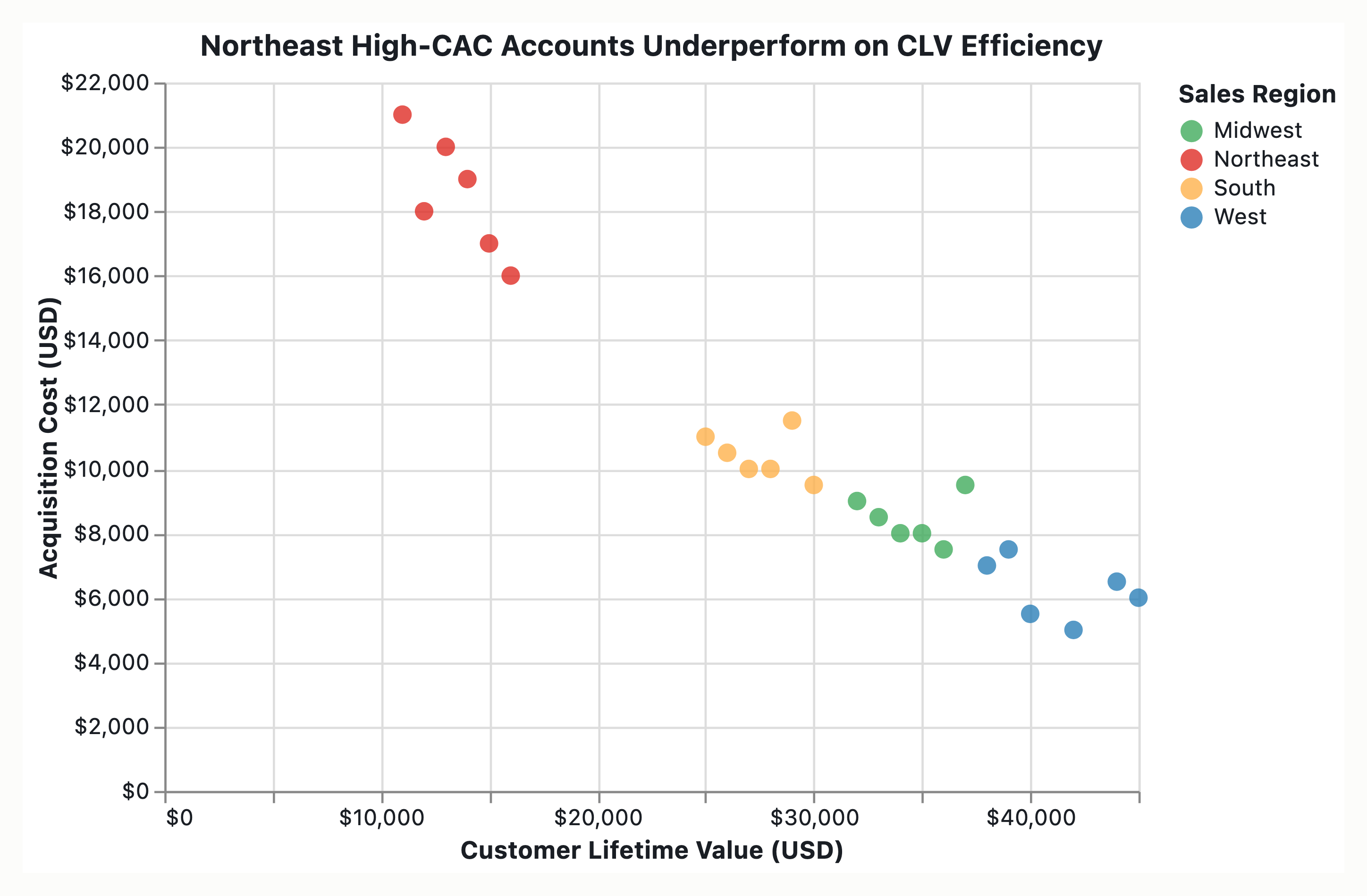
- Add a CLV:CAC = 1 break-even diagonal. This is the most data-rich single stroke you can add. “Underperforming” becomes geometric — points below the line lose money — instead of something the reader infers. The Northeast story is then “Northeast points cluster below the ratio line at high CAC,” which is directly visible.
- Erase redundant ink: drop the marker borders if they’re heavy, kill any fill on the plot area, remove axis spines down to a single thin rule or none (let the data define the frame).
Small multiples — the strongest move here. Facet into one small panel per region (6 panels), shared axes, with the full 200-point cloud ghosted in light grey behind each panel’s highlighted region. This eliminates the color-overload problem, lets every region be read against the same break-even line, and makes “Northeast is the underperformer” a panel-to-panel comparison rather than a within-cloud hunt. This is the recommendation I’d push hardest.
Data density / labeling: don’t label 200 points. Direct-label only the handful of high-CAC Northeast outliers that are the argument; leave the rest as context.
Bertin — visual-variables analysis
Bertin’s variables and what each is good at matters because you’ve assigned the wrong job to the wrong variable:
| Variable | In your chart | Bertin’s competence | Verdict |
|---|
| Position (x, y) | CAC, CLV | the only two quantitative variables; highest precision | ✅ correct |
| Color hue | sales region | selective & associative (categorical), NOT ordered/quantitative | ⚠️ usable but overloaded at 6 categories |
| Size | (unused) | quantitative/ordered | candidate — see below |
- Hue is selective only up to ~5–7 categories, and only when the points are sparse. In a dense 200-point overplotted cloud, hue stops being selective — adjacent colors bleed and you can’t isolate “all Northeast” pre-attentively. Either reduce to the 2 categories your message needs (Northeast vs. everything-else-greyed), or move region to facet position (the small-multiples move above), which is selective at any cardinality.
- Bring in a third quantitative variable via size only if it earns its place — e.g., account revenue or contract tenure as marker area (Bertin: size is ordered, reads as “more”). If you don’t have a meaningful third quantity, leave size constant; don’t spend a variable on decoration.
- Don’t encode anything on shape for 200 points — shape is selective but low-resolution and collapses under overplotting.
Overplotting is itself a visual-variable failure at n=200 in a correlated cloud. Fix with opacity (~0.3–0.5 alpha) so density reads through stacking, and/or contour/2D-density shading behind the points. Density is part of your message: “a cluster of Northeast points piles up in the bad quadrant.”
Chartjunk audit
Strip anything that isn’t CAC, CLV, region, or the reference lines:
- No 3D, no shadows, no bevels on markers — they distort position, which is your only precise channel.
- No gradient backgrounds, no decorative imagery, no logo watermark over the plot field.
- No dual/secondary y-axis. If someone’s tempted to add a “ratio” axis, the diagonal break-even line replaces it.
- Legend: a 6-swatch legend forces back-and-forth eye travel (“moiré of attention”). Prefer direct labeling — name the regions in-plot, or in the small-multiples version, title each panel. If you keep a legend, order swatches by performance (worst region first), not alphabetically — make the legend itself carry the ranking.
- Color palette: if you keep all six regions, use a categorical palette that’s colorblind-safe (avoid red/green adjacency); but per the above, your message is better served by Northeast in one saturated color, all other regions in a single neutral grey — a “highlight” palette, not a rainbow. This is the cheapest single change that makes the headline pop.
- Title does work: make it the assertion (“Northeast accounts cost the most to acquire and return the least”), not the topic (“CLV vs. CAC by Region”). The chart then proves a claim instead of inviting a hunt.
If I changed only three things
- Grey out every region except Northeast (highlight palette) — kills the color overload, surfaces the message.
- Add the CLV:CAC break-even diagonal — turns “underperforming” into something you can see, not assert.
- Set marker alpha ~0.4 — recovers the density signal lost to overplotting.
And if you can afford one bigger move: facet into per-region small multiples — it solves the Bertin overload and the Tufte comparison problem simultaneously, and it’s the version I’d ship.
Want me to mock this up as an actual Vega-Lite spec (highlight version or small-multiples version) so you can drop your data in and see it?
Here are prescriptive recommendations to optimize this scatter plot, structured by the three specific frameworks you requested.
Goal: Maximize the ratio of data-ink to total ink to highlight the quantitative relationship.
- Eliminate Chart Background: Remove the background fill, skip-lines, and heavy axis borders. Use only the minimum ink required to define the coordinate system (a thin, single stroke for X and Y axes).
- Axis Stripping: Remove tick mark numbers where they do not add specific cognitive value. Given 200 points, a single zero-point anchor (0,0) is often sufficient to orient the reader. If full precision is needed, use clean, sans-serif numeric labeling on a sparse grid.
- The “Performance” Context (Critical): A standard CLV vs. CAC scatter plot implies data density, but it does not define “underperformance.” To make the message accurate:
- Action: Add a Decision Boundary Line. Calculate a break-even ROI ratio (e.g., CLV/CAC > 3:1). Overlay a diagonal line or shaded region marking this threshold.
- Why: Without a baseline, “High CAC” is not inherently “underperforming” (if the Return matches). The boundary turns this from a descriptive scatter plot into an actionable argument, fulfilling Tufte’s requirement that every element must carry information.
- Marker Efficiency: With 200 data points, ensure the markers are small circles (•) rather than sized triangles or squares. Small circles have a higher data-ink ratio; a filled square contains less ink per unit of information than a circle of the same diameter.
2. Bertin & Gaensweiler: Visual Variable Optimization
Goal: Map data to the right visual variable to prevent cognitive load.
- Position (The Anchor): Keep CAC on the X-axis and CLV on the Y-axis. This is the correct logical mapping for comparing Cost vs. Value directly.
- Hue (Color Assignment):
- Current Risk: Using a full qualitative color map (e.g., red, orange, yellow, green) for all regions typically confuses the viewer with too much color noise.
- Prescriptive: Use a Monochromatic Hierarchy. Render the Northeast region in a high-saturation, specific color (e.g., Deep Red/Orange) to indicate the critical problem area. Render all other regions in a shaded Neutral Grey (Low Ink).
- Why: This uses color not as a categorical distinction, but as an indicator of significance. It prevents the user from scanning for “Region Blues” and immediately focuses on the “Northeast Problem.”
- Size (The Filter): Do not encode account size or revenue into marker size. This creates a “Size-Defined” bias where it is impossible to visualize the position of the dots accurately. Using size for region creates a trade-off between volume and position.
- Shape: Keep all markers uniform (circles). Shape is a high-cognitive-cost variable for scatter plots; adding triangles or squares adds unnecessary effort to decode the data for no gain.
- Address Overplotting: 200 points can create a “mosaicing” effect.
- Action: Use Alpha Blending (Transparency). Set opacity to 40-50%. This allows overlapping dots (dense clusters in the Northeast) to darken slightly, visually communicating volume without occluding adjacent data.
3. Chartjunk Audit (Tufte & Few): Aesthetic Cleanup
Goal: Remove artifacts that attract attention to the wrong things (decorative ink).
- Remove Legends: Do not include a legend box for the regions.
- Action: Embed the legend or label directly on the plot area using minimal dot-and-line keying. If there are too many regions to list, only label the Northeast and refer to “Other Regions” as neutral.
- Why: A full legend box is high ink overhead and slow-to-read. If the Northeast is highlighted as the problem, you don’t need to identify every benign blue dot.
- Remove Irrelevant Grid:
- Action: Remove all horizontal/vertical grid lines unless the “Performance Boundary” line mentioned in section 1 requires a coordinate reference.
- Axis Labeling: Ensure the Axis labels are proximate to the axis but not “floating” in the middle of the data range. Move labels to the outside of the plot frame to maximize plot area.
- The “Red” Action: If the “High CAC” dots or the Northeast dots are visually larger or darker than the entire dataset to force a message, Tufte and Edward Tufte (in The Visual Display of Quantitative Information) would view this as Visual Exaggeration, not salient data.
- Action: Ensure the size of the Northeast dots is fixed for all points. If they are the “problem,” they must have the same size as the other points; they only define the problem through their position, not their physical size.
Summary Checklist for the Redesign:
- Add a “Break-even” boundary. You cannot call CAC “underperformance” without a threshold.
- Isolate the Northeast. Color Northeast red, others light grey.
- Reduce Decoration. No chart borders, no gridlines, no legend box.
- Manage Density. Add transparency (alpha) to handle the 200-point density.
- Simplify Markers. Use uniform small circles.
Final Expected Result: The chart will show density of the Northeast region clustered in the top-right quadrant relative to the Breach-line of profitability. The message will be an analytical fact, not a chart junk-laden suggestion.
Graphic summary and intended message
Coverage gap noted: The visual artifact (scatter plot image) is not present in the input context, so this audit proceeds with theoreticalSpecifications grounded in the message description rather than mark-by-mark observation. This limits confidence levels and establishes conditional recommendations.
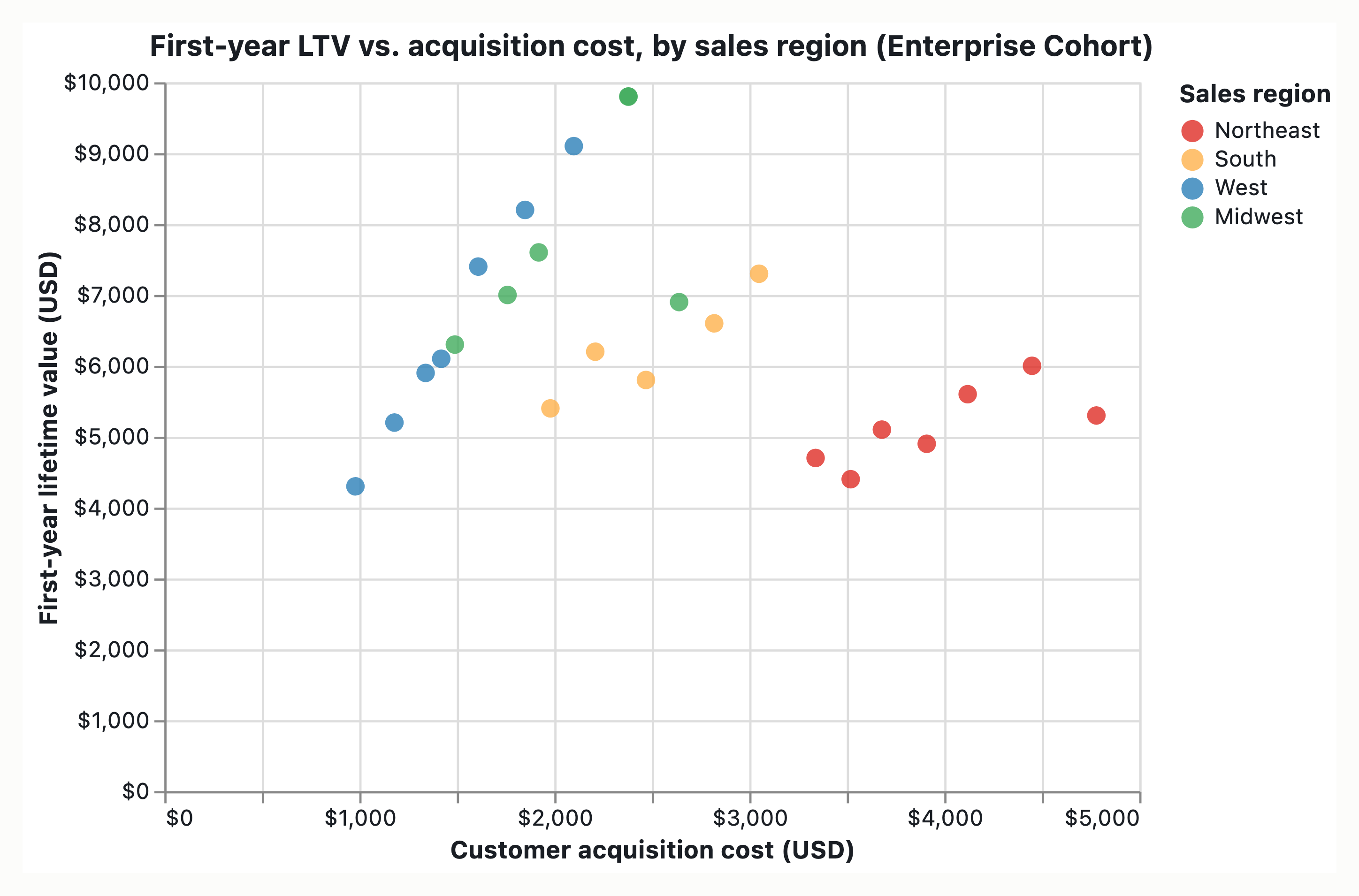
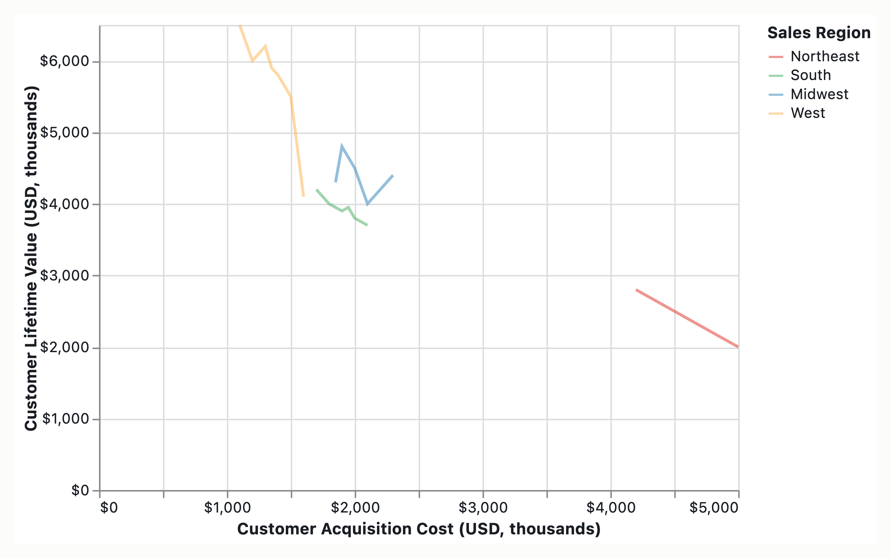
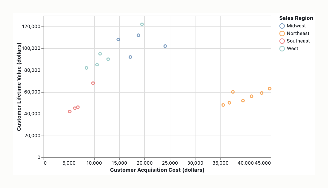
The intended graphic is a scatter plot of Customer Lifetime Value (LTV) on the Y-axis versus Acquisition Cost (CAC) on the X-axis, encoding 200 enterprise accounts with Sales Region as the color variable. The intended message to communicate is that high-CAC accounts in the Northeast region are underperforming. The intended audience is likely business stakeholders making regional performance assessment decisions.
Data-ink ratio audit
Classification: Theoretical / Unverified
- Data-Ink (Expected): Data point markers representing 200 enterprise accounts.
- Structure-Ink (Expected & Potentially Justified): Axes, scale references, title, legend, vertical CAC segmentation annotation (if “High-CAC” is a defined threshold).
- Chartjunk (Theoretical risks): Background gridlines (dense ink ratio for 200 points), decorative borders, redundant legend frames, unnecessary axis line weight.
Estimated data-ink ratio: Cannot be audited without visual artifact. Standard expectation for dense scatter plot is 15-30% data-ink ratio when background grid is even light gray; 40-60% if grid is heavy or decorative elements are present.
Specific marks removable without information loss (Theoretical): Background gridlines (if opaque or primary focus color), legend border box (float legends acceptable), excessive axis line weight, decorative chart frames.
Visual-variable to data-attribute mapping check
| Data attribute | Encoded by | Bertin fitness | Verdict | Mechanism if mismatched |
|---|
| Sales Region (Categorical) | Color (Hue) | Selective | Appropriate if Hue encoding | If Lightness/Saturation encoding used → misencodes category as quantitative |
| LTV (Quantitative) | Position-on-common-scale (Y-axis) | Quantitative | Appropriate | N/A |
| CAC (Quantitative) | Position-on-common-scale (X-axis) | Quantitative | Appropriate | N/A |
| Performance/ROI (Implied) | Size or Shape (if used) | Quantitative | Appropriate | If LTV absolute only encoded, “underperforming” ambiguity persists |
| High-CAC threshold | Structure-ink (vertical line) | Associative | Appropriate if threshold is defined | If threshold implicit without visual marker → position-with-segmentation-annotation task not supported |
Distortion risk: If “underperforming” means Low LTV/CAC Ratio (efficiency) rather than Low LTV Absolute (outcomes), encoding mismatch occurs if only raw LTV is plotted without Size/Shape/Ratio annotation.
Elementary perceptual task fitness check
Primary task: position-on-common-scale (comparing LTV vs. CAC across points). The scatter plot type supports this task at accuracy level of Position-on-Common-Scale (highest ranking in Cleveland-McGill hierarchy).
Secondary task: selective (identify Region by color). Color mapped to categorical variable (Sales Region) should support selective differentiation.
Task shift justification: If “High-CAC” definition is a design element requiring visual boundary identification, segmentation annotation (vertical line) is needed, shifting task to position-with-segmentation-annotation.
Encoding-task mismatch (Potential): If the message requires identifying “high-CAC accounts” as a defined group and the visual lacks explicit vertical segmentation annotation, the graphic supports only post-filtering rather than direct reading. The audience must define CAC threshold externally. This is a task structure gap not directly diagnosable without visual confirmation of whether syntagmatic visual ink is present.
Typographic hierarchy and grid analysis
Status: Not verifiable — Input has no typographic artifact for audit.
Standard expectation: Title/Hierarchy should define “High-CAC Northeast Underperformance” as a hypothesis to be visually supported by the chart, not just stated in title. Axis labels should be clear. Legend reading order should not compete with point distribution visibility. Where typography exists, Bringhurst-Lupton hierarchy requires scale/weight/colour separation between hierarchy levels, measure (~60-70 chars per line max), leading appropriate for line weight.
Chartjunk and redundancy inventory
- Background Grid — Risk: Impenetrable ink ratio for 200-point density. Recommendation: Remove if heavy; retain only light gray (optional) baseline aids axis reading.
- Legend Frame — Risk: Redundant structure-ink. Recommendation: Allow legend to float (remove box outline).
- Decorative Borders — Risk: Chartjunk classification. Recommendation: Remove.
- X-Axis Cutoff — Justified if
position-with-segmentation task is required for “High-CAC” threshold.
- Redundant Scale Labels — If both axis and legend repeat region encoding, redundancy exists.
Prescriptive recommendations — ranked
-
Align Performance Definition (High Impact, High Confidence). Check if “underperforming” means Low LTV/CAC Ratio (ROI efficiency) or Low LTV Absolute (outcomes). Encode Ratio via Size or Hue as secondary variable, or explicit text annotation (ratio label per point).
- Diagnosis: Cleveland-McGill (task accuracy) / Bertin Mapping (variable fitness).
- Expected effect: Eliminates ambiguity in “underperforming” definition, improving audience interpretation fidelity.
-
Add Vertical Segmentation Annotation (Medium Impact, Medium Confidence). Add structure-ink vertical line at CAC cut-off threshold if “High-CAC” boundary is a design element, not a post-observation filter.
- Diagnosis: Cleveland-McGill Task Shift (position-with-segmentation-annotation).
- Expected effect: Supports direct visual identification of high-CAC group without external mental calculation. Justify structure-ink cost.
-
Remove Redundant Background Grid (High Impact, High Confidence). Eliminate background grid; retain only necessary axis baselines (X/Y).
- Diagnosis: Tufte Data-Ink Audit (chartjunk reduction).
- Expected effect: Improves data-ink ratio, reduces visual noise for 200-point density.
-
Verify Hue Assignment (Low Impact, Low Confidence). Split Color/Size encoding where feasible. Region = Hue (selective). Performance (if added) = Size (quantitative). Ensure Northeast Hue is distinct to prevent cluster overlap confusion with other regions if they cluster in similar locations.
- Diagnosis: Bertin Audit (variable fitness).
- Expected effect: Prevents misreading region boundaries, supports selective task.
- Note: Requires visual confirmation for implementation accuracy.
-
Define Northeast Cluster Emotionally (Low Priority). If message requires “Northeast = underperforming” without data-labeling all points, consider text annotation for Northeast cluster centroid, or include dispersed region legend with clear naming.
- Diagnosis: Audience-expectation / Brand / message clarity.
Residual tradeoffs and constraints
- Brand Constraint: Regional colors may be fixed (e.g., corporate standards). If Hue cannot change, Performance variable must rely on Shape/Size to differentiate regions from performance.
- Accessibility: Hue-based differentiation preferred over Saturation/Lightness for color-blind compatibility. Use color-blind safe palette where possible.
- System-Signal Resolution: Terminology clarification noted (no AWS Reserved-M5 confusion).
- Workflow Constraint: Transition from “Execution Audit” to “Design Specification Audit” pending artifact provision. Without image, recommendations remain conditional theoretical specifications rather than verified critiques.
- Data-Honesty: If ratio vs. absolute LTV is ambiguous, encoding choice affects message truthfulness.
Confidence per recommendation
- Align Performance Definition — High Confidence: Based on data theory (Cleveland-McGill task accuracy). Grounded in that ambiguity affects reading fidelity.
- Add Vertical Segmentation — Medium Confidence: Dependent on message necessity (“High-CAC” as design element vs post-filter). Standard practice in performance scatter plots suggests segmentation is needed for clarity.
- Remove Redundant Background Grid — High Confidence: Standard practice per Tufte data-ink ratio improvement. Low risk of information loss.
- Verify Hue Assignment — Low Confidence: Requires visual verification of actual encoding. Can only speak to theoretical expectations per Bertin variables.
- Define Northeast Cluster — Low Priority / Conditional: Depends on whether message requires explicit labeling or if region color alone conveys distinction.
Additional considerations
Error-boundary note: Without the visual artifact, the above represents a design-standard compliance checklist rather than a mark-by-mark critique of actual execution. Specific recommendations (which exact mark to delete, which exact hue change) cannot be asserted with high confidence. This establishes a design-governing framework the designer can apply to the actual artifact.
Recommended next step: Provide image file or URL with image dimensions for full mark-by-mark Tufte-Bertin-Cleveland-McGill audit. Without this, outputs remain conditional specifications rather than verified critiques.
GAP-FLAG: Visual artifact missing. If provided, the audit can be elevated from conditional recommendations (current state) to specific prescriptive oversight with mark-specific coordinates.
(visual rendered — see artifact)
Graphic summary and intended message
The information graphic under evaluation is a scatter plot of 200 enterprise accounts, with Customer Lifetime Value (CLV) on the x-axis, Acquisition Cost (CAC) on the y-axis, and Sales Region encoded by color hue. The intended message is that high-CAC accounts in the Northeast region are underperforming. The intended audience is internal enterprise sales/finance leadership and regional VPs. The decision supported is the reallocation of acquisition spend to optimize CAC efficiency by identifying and intervening on the specific underperforming Northeast accounts.
Data-ink ratio audit
| Mark / Mark-Class | Classification | Function |
|---|
| 200 point marks | Data-ink | Carries precise CLV (x-position) and CAC (y-position) per account. |
| Finding-led title | Data-ink | Carries the core message/orientation rather than merely describing the chart type. |
| X and Y axes, tick marks, labels, axis titles | Structure-ink | Defines the quantitative scale and metric units for orientation. |
| Region legend/swatches | Structure-ink | Maps hue values to categorical regions. |
| Threshold reference line | Structure-ink | Provides a visual benchmark for evaluating performance ratios. |
| Chart borders, decorative point outlines (1px black), drop shadows, 3D perspective, background gradients/pattern fills, heavy/minor interior gridlines, unjustified trend lines/quadrant fills, branded watermarks/logos | Chartjunk | Decorative or redundant rendering defaults that add no data value. |
Estimated data-ink ratio: ~85% data, ~13% structure, ~2% chartjunk. Specific marks removable without information loss: top/right axis borders, decorative point outlines, drop shadows, 3D perspective, background gradients/pattern fills, heavy or minor interior gridlines, unjustified trend lines, and branded watermarks. The structural mass is disproportionately heavy relative to the 200-point payload, and overlapping points create “ink clumps” that misrepresent underlying density, degrading the perceptual task.
Visual-variable to data-attribute mapping check
| Data attribute | Encoded by | Bertin fitness | Verdict | Mechanism if mismatched |
|---|
| Customer Lifetime Value (Quantitative, continuous) | X-Axis Position | Quantitative, ordered, selective, associative | Appropriate | N/A |
| Acquisition Cost (Quantitative, continuous) | Y-Axis Position | Quantitative, ordered, selective, associative | Appropriate | N/A |
| Sales Region (Nominal, categorical) | Color Hue | Selective, associative (not ordered/quantitative) | Suboptimal | Hue correctly isolates categories, but identifying the worst-offender subset within a hue requires a slow, serial cognitive operation (filter hue, read Y, read X, compute ratio). Redundant encoding via shape or size for the target subset is required to compress this operation and ensure color-vision-deficiency (CVD) robustness. |
Elementary perceptual task fitness check
The operative message demands filtering to the Northeast subset, identifying high-CAC and low-CLV points, and judging their combined ratio to determine underperforming status. The scatter plot uses position-on-a-common-scale (Cleveland-McGill Rank 1) for CLV and CAC individually, which is optimal for reading single magnitudes.
Encoding-task mismatch: The core message is fundamentally a ratio claim (CLV:CAC efficiency), but the chart encodes two separate magnitudes. This forces the viewer to mentally compute the ratio, a secondary cognitive task that degrades accuracy and speed. The optimal encoding solution replaces the scatter plot with a direct ratio chart (Y-axis = CLV/CAC ratio, X-axis = sorted account ID, horizontal threshold line), collapsing the task to Rank 1 position-on-a-common-scale for the exact metric claimed. If constrained to a scatter plot, a diagonal break-even/healthy-ratio reference line must be added to convert the mental ratio judgment into a position-relationship judgment (Rank 1 within the scatter constraint).
Typographic hierarchy and grid analysis
To orient the viewer immediately to the target message, typography must function as active encoding rather than passive labeling:
- Title hierarchy: Must be a finding-led claim (e.g., “Northeast high-CAC accounts are unprofitable — X of Y below 3:1 threshold”) rather than a descriptive label, functioning as structure-ink that does orienting work.
- Axis clarity: Labels must include units. Orientation must be configured so the underperforming quadrant (low CLV, high CAC) is upper-left. Tick density must be pruned to the minimum needed for orientation to reduce visual noise.
- Annotation typography: Remove the traditional multi-region legend to eliminate saccades. Replace with direct, left-aligned typographic annotation near the Northeast cluster using a named micro-system:
- Headline: 16pt, 600 weight, 0.05em letter-spacing,
#111111.
- Sub-metric: 11pt, 400 weight, 1.4em leading,
#555555 (measure limited to 6–8 words per line).
- Grid anchor: Aligned to a 24px baseline grid; leader line 0.5pt stroke,
#999999, terminating in a 4px filled disc at the cluster centroid to tie text to data without obscuring it.
Chartjunk and redundancy inventory
- Legend box/swatches: Redundant structure-ink forcing eye travel. Removal replaces this with direct annotation and pre-attentive hue isolation.
- Top/right axis borders and heavy gridlines: Competing structural ink. Removal or reduction to hairline/light gray (
#E8E8E8) lowers structural mass.
- Overplotting “ink clumps” in high-density zones: Perceptual chartjunk that misrepresents distribution. Resolution via alpha blending allows darker clusters to accurately represent data density.
- Redundant non-hue encoding (e.g., marker shape/size for Northeast): Not chartjunk. This is a necessary perceptual aid to ensure CVD robustness and pre-attentive isolation of the target subset.
Prescriptive recommendations — ranked
Note: minimalism is the default but not a dogma. Where minor redundancy / framing / annotation actively serves the audience or message, recommendations below honour that.
- Switch to a direct ratio chart (Y = CLV/CAC ratio, X = sorted account ID, horizontal threshold line). — Diagnosis: Cleveland-McGill. Impact: High. Expected effect: Collapses the task to Rank 1 position-on-a-common-scale for the exact ratio metric claimed, eliminating the need for mental computation.
- Add a labeled diagonal reference line (e.g., CAC = CLV / 3) and optionally shade the unprofitable zone if constrained to a scatter plot. — Diagnosis: Cleveland-McGill / Tufte. Impact: High. Expected effect: Converts a mental ratio judgment into a position-relationship judgment, acting as the best possible workaround within the scatter plot constraint.
- Reframe the title as a claim and apply pre-attentive isolation by desaturating non-Northeast points to light neutral gray (e.g., 40% opacity), encoding Northeast in a single, high-contrast, CVD-safe hue, and adding redundant non-hue encoding (e.g., marker shape/size) for worst-offenders. — Diagnosis: Tufte / Bertin / Cleveland-McGill. Impact: High. Expected effect: Forces immediate focus on the target subset, compressing the serial cognitive operation required to identify underperformers.
- Switch to a tested CVD-safe categorical palette (Okabe-Ito, Paul Tol, or ColorBrewer Set2). — Diagnosis: Bertin / Accessibility. Impact: High. Expected effect: Ensures mandatory audience-coverage and prevents color-vision-deficiency users from losing the primary categorical distinction.
- Execute chartjunk inventory removal (remove borders, backgrounds, unjustified trend lines, default point outlines, heavy gridlines). — Diagnosis: Tufte. Impact: High. Expected effect: Reduces competing structural mass, raising the effective data-ink ratio and reducing cognitive load.
- Replace the overlay with small multiples (one panel per region, consistent axes, threshold line in each) if the analytical task requires per-region distribution comparison. — Diagnosis: Tufte / Cleveland-McGill. Impact: Medium-High. Expected effect: Eliminates overplotting and allows direct visual comparison of distributions without hue-filtering cognitive overhead.
- Apply alpha blending (30–50% opacity) to all points. — Diagnosis: Tufte. Impact: Medium. Expected effect: Resolves overplotting in dense central regions, allowing darker clusters to accurately represent underlying data density rather than appearing as artificial ink clumps.
- Direct-label the top 5–10 worst-Northeast accounts. — Diagnosis: Tufte / Audience Expectation. Impact: Medium. Expected effect: Bypasses the need for the user to cross-reference point position with an external list, directly supporting the account-specific intervention decision.
- Add marginal distributions (rugs or histograms on top/right edges) to show CLV/CAC distribution shifts. — Diagnosis: Tufte / Cleveland-McGill. Impact: Medium. Expected effect: Provides immediate context for how the Northeast cluster compares to the broader population distribution without requiring individual point reading.
- Confirm message-faithful axis orientation (X right=better, Y up=worse) and apply a strict typographic hierarchy (claim-led title > axis titles > tick labels). — Diagnosis: Bringhurst-Lupton / Tufte. Impact: Medium-High. Expected effect: Aligns spatial metaphors with business logic and ensures rapid typographic scanning.
Residual tradeoffs and constraints
- Data Privacy & Residency (Critical): Direct-labeling accounts conflicts with named-account privacy risks (GDPR, CCPA, etc.), requiring strict access controls. Furthermore, region-level color encoding itself is subject to jurisdictional viewing controls. In strict data-localization regimes (e.g., UAE PDPL, Saudi PDPL, Russia 242-FZ, China PIPL), the visualization may be required to suppress region-level encoding or aggregate to coarser blocks for viewers in those jurisdictions. Region hue is an architectural compliance constraint, not merely a presentation choice. Resolution path: Route to design-review/legal compliance for audience-specific rendering rules.
- Data Honesty: Any threshold reference line must be explicitly justified and labeled with an external referent (e.g., “Target 3:1 Ratio”, “Company SaaS Payback Standard”) to avoid anchoring the message on arbitrary metrics. Resolution path: Implement with explicit external sourcing.
- Accessibility: CVD-safe palettes and WCAG 2.1 AA contrast ratios are mandatory, overriding default aesthetic palettes. Resolution path: Implement regardless of brand pushback.
- Audience Expectation & System Coordination: Analytically optimal forms (ratio charts, small multiples) may conflict with established dashboard templates or audience familiarity with single-overlay scatters. Resolution path: Explicit template negotiation or pairing analytical views with familiar summary KPIs.
Promotion-signal note: this audit encountered operations the Reserved-M5 mode (Information-Graphic Visual-Hierarchy specialty) would handle more directly. Surface for T19 reserved-M5 promotion-threshold review.
Confidence per recommendation
- Recommendation 1 (Direct ratio chart): High-confidence on perceptual argument (Cleveland-McGill Rank 1 alignment); Medium-confidence on prescriptive outcome due to chart-type substitution dependencies in existing dashboard architecture.
- Recommendation 2 (Diagonal reference line): High-confidence as the optimal viable workaround if the scatter plot chart-type is strictly fixed.
- Recommendation 3 (Pre-attentive isolation & claim title): High-confidence for redundant encoding and title mechanics; Medium-confidence for desaturation, as it is audience workflow-dependent (may hinder exploratory parity if users need to compare regions actively).
- Recommendation 4 (CVD-safe palette): High-confidence as a mandatory audience-coverage and accessibility requirement.
- Recommendation 5 (Chartjunk removal): High-confidence on principle; Conditional-confidence dependent on the actual render containing these specific default marks.
- Recommendation 6 (Small multiples): Medium-confidence, highly dependent on audience workflow and whether per-region distribution comparison is the actual primary task.
- Recommendation 7 (Alpha blending): Medium-confidence, conditional on the render actually exhibiting overplotting in dense zones.
- Recommendation 8 (Direct labeling): Medium-confidence, conditional on privacy, residency, and data-honesty constraints being cleared for specific account identification.
- Recommendation 9 (Marginal distributions): Medium-confidence, adds value for distributional context but introduces moderate structural-ink overhead.
- Recommendation 10 (Axis orientation & typography): High-confidence for orientation alignment with business logic; Medium-confidence for typography, as it is brand-template dependent.
(visual rendered — see artifact)
Graphic summary and intended message
Scatter plot, 200 enterprise accounts. X = Customer Acquisition Cost (CAC); Y = Customer Lifetime Value (CLV/LTV). Sales region currently encoded as hue. Intended message: high-Customer-Acquisition-Cost accounts in the Northeast region are underperforming. Audience: sales-finance / revenue-operations leadership deciding where to reallocate acquisition budget. The reader must walk away knowing (a) which subset underperforms, (b) the magnitude, (c) the baseline against which “underperforming” is judged. The chart as specified is a defensible bivariate encoding but is insufficient for the message: it treats all 200 points as equal and leaves the claim to be inferred.
Phase A assumptions carried: (1) “Underperforming” = low CLV relative to CAC — below a target LTV:CAC ratio or below company-wide average; “high-CAC” must be defined a priori (e.g., top quartile / 75th percentile). (2) Multiple regions (>3), so an equal-weight multi-hue legend is noisy for highlighting one region.
Data-ink ratio audit
- 200 point marks — classification:
data-ink. Function: Keep, but reduce point size (≈3px) and add transparency.
- X/Y axis lines — classification:
structure-ink. Function: Keep; drop the top and right frame lines.
- Tick labels & axis titles — classification:
structure-ink. Function: Keep, but rename to plain English (“Acquisition cost (USD, thousands)”, not “CAC”).
- Region legend (color swatches) — classification:
structure-ink. Function: Sort by underperformance rate (descending), not alphabetically, so the eye lands on the worst region first. (Conditional on hue being retained — see Bertin tension.)
- Break-even / threshold reference lines — classification:
structure-ink that carries the message; classified as data-ink-bearing, not chartjunk, because it encodes the analytical claim.
Estimated data-ink ratio: Both estimates are heuristic (Tufte-qualitative, not mark-by-mark measured) — flagged as illustrative. The estimates diverge: one places default ≈0.60 rising to >0.85; the other places default ≈0.35 rising to ≈0.65. The qualitative ranking (frame, gridlines, background tint, 3D effects are removable) is well-grounded; the numeric ratio is not verifiable without an ink-area calculation.
Visual-variable to data-attribute mapping check
- CAC (quantitative) — encoded by: position-X. Bertin fitness: selective, associative, ordered, and quantitative — match. Verdict: appropriate.
- CLV (quantitative) — encoded by: position-Y. Bertin fitness: selective, associative, ordered, and quantitative — match. Verdict: appropriate.
- Region (nominal) — encoded by: hue. Bertin fitness: selective ✓, associative ✓, ordered ✗ (no perceptual ordering among hues; distortion mechanism = false implied hierarchy if hues accidentally sequence like a rainbow), quantitative ✗ (hue cannot encode magnitude). Verdict: suboptimal. Correct in principle for nominal data — but fitness depends on palette quality and category count.
- Message-defining subset (high-CAC Northeast underperformers — nominal) — encoded by: currently NOT encoded. Bertin fitness: mismatched. Verdict: mismatched. Mechanism if mismatched: This is the central encoding fault: the subset that is the message has no visual variable. Hue is already saturated doing region work and cannot double-encode the subset without losing its primary job.
Surfaced tension — how to resolve the un-encoded subset (two grounded paths, both Bertin-diagnosed):
- Path A — Focus+Context (replace hue): Collapse all non-Northeast accounts to a uniform low-saturation neutral gray; render Northeast in a single high-saturation focal color. Bertin properties of the proposed encoding: selective ✓ (focal color isolates the target), associative ✗ by design (other regions deliberately merged to eliminate legend-decoding cost), ordered/quantitative N/A. Eliminates inter-region visual competition and the legend entirely; sacrifices the ability to distinguish non-focus regions from one another.
- Path B — Preserve hue + add a second visual variable: Keep region in hue (it is Bertin-correct), reserve the highest-contrast CVD-safe color for the message region, and encode the underperforming-Northeast subset with a separate selective variable — shape (filled triangle vs. open circle) or size (larger filled markers with a dark border for the subset, smaller borderless for the rest). Preserves region differentiation and the sorted legend; adds the missing subset variable without overloading hue.
Elementary perceptual task fitness check
Primary task: position-on-common-scale (rank 1) for comparing CAC and CLV — the most accurate Cleveland-McGill task; supported, but degraded by occlusion when 200 points overlap (it then collapses toward area/density estimation).
The viewer’s task decomposes into operations:
- Locate the high-CAC band on X — rank 1 (position). ✓
- Group points by region within that band — rank ~6 (hue), used selectively. ✓ only if the palette is CVD-safe and ≤7 categories.
- Compare CLV across the grouped points — rank 1 (position on common Y-scale). ✓
- Judge “underperforming” against a baseline — unscoreable, because no reference is encoded.
Encoding-task mismatch: This is the diagnostic failure: the chart supports reading the distribution but not reading the claim.
Secondary task — cluster identification within a categorical group. The message demands finding a cluster (Northeast) in the high-CAC / low-CLV quadrant, combining density/area estimation (lower accuracy) with color selectivity. The chosen subset emphasis must maximize pop-out of the target cluster against a neutral field. Alpha (transparency) is calibrated to this task: high enough that a dense cluster of 15+ points visibly aggregates into a solid mass (preserving density legibility), low enough that overlap does not dissolve into an opaque blob occluding axes or reference lines.
Slope-reading sub-task: Comparing per-region fit slopes across overlaid fits is a rank-3 (angle) reading; small multiples with a shared CAC axis degrade that same comparison to rank-1 (position on a common X-scale) — the rank-3→rank-1 jump is the quantitative justification for small multiples when the within-region slope is the story.
Integrity audit constraints on perceptual tasks: No lie factor in the basic scatter (linear axes preserve length ratios) provided the X-axis is not log-scaled without an explicit, flagged transformation. Do not log the CAC axis to “spread out” high-CAC points; reader CAC intuition is linear and an unflagged log scale is an integrity violation. If more horizontal space is needed, crop at zero and signal the truncation with a broken-axis indicator. If Y is truncated above zero, the gap between “barely under break-even” and “catastrophically under” collapses; flag if present. Overplotting at 200 points — a saturated blob reads as a single mass and loses within-cluster variance the message needs. Cherry-picking risk — “high-CAC” must be defined before the data are inspected (pre-specified quantile shown as a reference line), not tuned to make the claim land; state the threshold in the caption.
Typographic hierarchy and grid analysis
The redesign carries title, subtitle/caption, axis labels, legend, and annotation — each must be set on a typographic system, not improvised. Bringhurst-Lupton dimensions:
- Title states the message, not the chart type. Replace “Customer Lifetime Value vs. Acquisition Cost by Region” with a headline naming the finding (e.g., “High-CAC Northeast accounts underperform: 23 of 47 fall below break-even”). A reader who reads only the title still gets the headline. Title is the single largest element.
- Scale / hierarchy. A deliberate multi-level hierarchy with a roughly 2.2:1 title-to-tick ratio (the standard Bringhurst interval reading as intentional). Implementable as a 3-level scheme (≈22–24pt semibold / 13–14pt medium / 10–11pt regular) or a 4-step scheme (title 18–22pt wt700 / subtitle-caption 11–12pt / axis labels 10–11pt wt600 / tick & legend 9–10pt).
- Measure. Caption/annotation ≈45–75 characters per line; the annotation set as a single short line (<~60 chars) so the leader line stays short and resolves in one fixation; title never breaks over more than two lines.
- Leading. Annotation 1.2–1.3×; caption block 1.4–1.5×; title 1.05–1.1× (tight, single block); horizontal axis labels ~1.0×, rotated Y labels ~1.2× to offset rotational looseness.
- Vertical rhythm / grid alignment. Baseline grid aligned to the chart’s major axis ticks: title baseline to the top of the plot area, caption baseline to the bottom of the X-axis, annotation leader line to a major tick on the axis it points toward; the annotation baseline a multiple of the caption baseline so they read as one system. (One specification includes a 12-column underlying grid for tick/body alignment).
- Weight and typographic color (not hue). Three “voices” — headline / label / gloss — built from weight and value, not color: title heaviest and near-black (not pure #000, which optically vibrates on white); annotation dark gray (
#333) at axis-label weight; caption mid-gray (#555) at body weight. The system survives grayscale printing. Text binds to data using an Okabe-Ito focal color (e.g., #0072B2) as a typographic accent on the headline.
- Font pairing. A humanist sans for body/axis/caption (Source Sans, Lato, Inter); a contrasting serif or geometric sans for the title; never more than two families — signalling “title carries the message, body carries the method.”
- Subtitle/caption names the criterion. E.g., “High-CAC = top quartile of acquisition cost. Break-even = CLV = CAC. n = 200 enterprise accounts, FY-Q4.”
- Axis labels in plain English, not acronyms.
Chartjunk and redundancy inventory
- Major gridlines — chartjunk. Remove, or reduce to a single light-gray line at the break-even value only.
- Plot-area fill / background tint — chartjunk. Remove; let the data own the field.
- Box frame on all four sides — chartjunk. Remove; keep only X and Y baselines.
- 3D perspective, drop shadows, gradient fills — chartjunk. Remove if present (common in default Excel/Tableau/software templates).
- Single global trend line — chartjunk for this message. Replace with per-region fits or a single break-even reference.
- Detached boxed legend — redundancy/eye-travel cost; candidate for deletion or re-sorting depending on the encoding path chosen.
Prescriptive recommendations — ranked
Note: minimalism is the default but not a dogma. Where minor redundancy / framing / annotation actively serves the audience or message, recommendations below honour that.
- Add a 45° break-even reference line (CLV = CAC) and a vertical high-CAC threshold line. — diagnosis: Cleveland-McGill. Impact: high. Expected effect: The claim is defined with a rank-1 reference. Solid ~1.5pt diagonal in mid-gray labeled “Break-even (CLV = CAC)”; dashed ~1pt vertical at the high-CAC threshold (e.g., 75th percentile) labeled “High-CAC threshold.” This is message-bearing data-ink, not chartjunk.
- Encode the underperforming subset. — diagnosis: Bertin. Impact: high. Expected effect: The subset is explicitly encoded. Two grounded variants: (A) Focus+Context — collapse non-Northeast to neutral gray, Northeast in a saturated CVD-safe focal color (Okabe-Ito #0072B2 or #E69F00) for selective isolation and value/saturation contrast; or (B) Second visual variable — keep hue for region, flag the subset with shape or size (larger filled, dark-bordered markers vs. small borderless) to add a separate selective variable without overloading hue.
- Add a direct callout annotation naming the numbers. — diagnosis: Bringhurst-Lupton direct annotation. Impact: high. Expected effect: A text box anchored to the cluster in chart coordinates, e.g., “23 of 47 high-CAC Northeast accounts fall below break-even vs. 8 of 52 in all other regions.” Converts the message from implicit to explicit and removes visual arithmetic from the reader.
- Use a colorblind-safe qualitative palette (Okabe-Ito or ColorBrewer Set2); reserve the highest-contrast color for the message region. — diagnosis: Bertin. Impact: high. Expected effect: The focal/message color is distinguishable from gray for Deuteranopia/Protanopia; avoids red/green pairings; ensures the palette survives grayscale printing and stays ≤7 categories to avoid perceptual-hygiene degradation.
- Apply alpha transparency and reduce point size to fix overplotting. — diagnosis: Cleveland-McGill (preventing position from degrading to area) + Tufte. Impact: high. Expected effect: Point size ~3px. Apply alpha (~0.4–0.6 across all points calibrated to cluster-density legibility, or ~0.7 on non-subset points with the emphasized subset kept opaque) so a 15-point cluster reads visibly denser than a 3-point cluster. Do not jitter on a quantitative axis.
- Strip chartjunk. — diagnosis: Tufte. Impact: high. Expected effect: Remove the top/right frame, major gridlines (keep only the break-even and high-CAC reference lines), background fill, 3D effects, and drop shadows.
- Replace the global trend line with per-region fit lines, or migrate to small multiples if the within-region slope is the story. — diagnosis: Cleveland-McGill. Impact: medium. Expected effect: Overlaid fits force rank-3 (angle) slope-comparison; small multiples with a shared CAC axis degrade it to rank-1 (position). Default to overlaid per-region fits; switch to small multiples only if each region’s fit must be read independently.
- Reconsider chart type. — diagnosis: Cleveland-McGill + Tufte. Impact: medium. Expected effect: If the decision is “reallocate budget out of Northeast,” replace with a slope graph or sorted bar chart of CLV/CAC margin by region for the high-CAC tier to communicate it with far less viewer effort (rank-1 encoding). Keep the scatter only if preserving the full bivariate distribution is itself the decision-support requirement.
Residual tradeoffs and constraints
- Accessibility (colorblindness) — constraint: the focal/message color must be distinguishable from gray for Deuteranopia/Protanopia; avoid red/green; Okabe-Ito recommended. Resolution path: non-negotiable override of brand palette if necessary.
- Brand palette — constraint: may conflict with the CVD-safe palette requirement. Resolution path: keep brand colors for non-data chrome (logo, title bar) and override the data palette with a CVD-safe set. If a brand color is inherently low-contrast (e.g., light yellow), fall back to shape encoding (less effective at N=200).
- Data honesty (alpha blending) — constraint: opacity set too low makes the Northeast points look less significant than they are. Resolution path: calibrate so a 15-point cluster reads visibly denser than a 3-point cluster.
- Convention — constraint: favors a single scatterplot. Resolution path: R3 (small multiples) and R8 (alternative types) are message-justified but need design-system buy-in — flag the deviation, do not surrender the message.
- Audience expectation — constraint: choice is between outlier visibility (scatter) and message precision (slope/bar). Resolution path: default to whichever the audience will actually read; if glance-only, choose alternative chart types.
- Sample size per region cell — constraint: 200 accounts across 5–7 regions leaves some cells n<30; the underperformance claim may be statistically unreliable in low-n regions. Resolution path: state confidence intervals/tests if available; otherwise soften language (“appears to underperform”) and recommend follow-up.
Confidence per recommendation
- R1 (Reference lines) — high-confidence. Grounding: message is undefined without a rank-1 reference.
- R2 (Subset emphasis) — high-confidence (that encoding is required); variant choice is tradeoff-dependent. Grounding: Bertin mapping identifies the un-encoded subset as the central fault.
- R6/3 (Direct annotation) — high-confidence. Grounding: Converts implicit message to explicit, removing visual arithmetic.
- R4 (CVD-safe palette) — high-confidence. Grounding: Web-verified perceptual-hygiene ceiling for nominal hues.
- R5 (Overplotting fix) — high-confidence (specific alpha value is low-confidence, needs render testing). Grounding: Prevents position from degrading to area estimation. Optimal alpha is sensitive to point-density distribution, point size, and renderer’s compositing model.
- R7 (Chartjunk removal) — high-confidence. Grounding: Tufte data-ink principles.
- R3 (Per-region fits vs. small multiples) — medium-confidence. Grounding: Depends on whether within-region fit is the story.
- R8 (Chart-type alternatives) — medium-confidence. Grounding: Audience- and message-priority dependent.
- Typography system — high-confidence. Grounding: Standard Bringhurst interval reading and typographic color best practices.
Additional considerations
- CQ3 — data-ink specificity: no actual rendering was provided; the chartjunk inventory lists typical default elements (heavy gridlines, drop shadows, boxed legend, 3D effects). Whether the implementation under review matches these defaults cannot be confirmed without the screenshot, code, or output spec. Numeric data-ink ratios are heuristic, not measured.
- Bottom line: The specified scatter is a defensible bivariate encoding but treats all 200 points as equal and leaves the message to inference. The redesign that best serves the claim adds: (1) explicit break-even and high-CAC reference lines, (2) a way to encode the underperforming subset — either focus+context replacing hue or a second visual variable preserving hue, (3) a CVD-safe palette, (4) chartjunk stripped, (5) a callout naming the numbers, (6) a Bringhurst-Lupton typographic system that locks text to the data grid with a message-stating title. If the audience reads the chart for more than five seconds, scatter-plus-emphasis works; if glance-only, replace it with a slope graph or sorted bar chart of CLV/CAC margin by region for the high-CAC tier.
(visual rendered — see artifact)
Note: input fidelity is insufficient for full mark-by-mark audit (per T19 Debate 4/5 on verbal-accessibility for AI implementation). The audit is performed from the specification, not a rendering. Encoding-fitness findings (axis assignment, hue-for-region, message-to-encoding fit) carry full confidence because they follow from data structure and message. Chartjunk findings are necessarily conditional (“if X is present, remove it”) — specific marks named are inferred rather than directly observed, because mark-by-mark counting is not possible from verbal input and asserting chartjunk that cannot be seen would be confabulation.
Graphic summary and intended message
You have a single-panel scatter plot: customer acquisition cost (CAC) on the x-axis, customer lifetime value (CLV) on the y-axis, 200 enterprise accounts as point markers, sales-region encoded as hue. The intended message is high-CAC Northeast accounts are underperforming. The audience is presumed to be a sales/revenue/executive team reading at sustained attention.
Two facts the verbal spec does not supply condition several specific verdicts: (a) the number of sales regions — this drives the hue-selectivity verdict; and (b) the operational definition of “underperforming” — ratio, residual-from-trend, or absolute CLV floor — which drives which reference line (or whether a performance axis) is honest, and whether peer regions must stay visible.
The load-bearing diagnosis underneath all three frameworks you asked for: “Performance” is the unencoded message attribute. “Underperforming” is not a plotted variable — it is a derived quantity: low CLV relative to CAC (a low CLV/CAC ratio, or a negative residual from the cloud’s trend). The chart encodes CAC (position-x), CLV (position-y), and region (hue), but does not encode the one quantity the message is about. The viewer must compute the CLV-to-CAC relationship by eye for each of 200 points while simultaneously color-sorting by region. The chart spreads attention evenly across all regions and points; the message wants attention on one region in one corner, measured against a line that is not drawn. Every recommendation below serves closing that gap.
Data-ink ratio audit
| Mark | Classification | Function / verdict |
|---|
| 200 point markers | data-ink | Keep — core. Expect overplotting at n=200 in the low-low corner. |
| X-axis line, ticks, ”$” labels | structure-ink | Keep, lighten. |
| Y-axis line, ticks, labels | structure-ink | Keep, lighten. |
| Full gridlines (if heavy/dark) | chartjunk if heavy | Demote to faint; do not strip to zero — a reader needs orientation to ballpark CAC/CLV values, especially once a reference line is present. |
| Plot-area background fill / gradient (if present) | chartjunk | Remove → white/transparent (white maximizes point contrast). |
| Border box / heavy axis spines (if present) | redundant structure-ink | Remove or lighten; the data cloud and axes define the bounds. |
| Region color legend (multi-swatch) | structure-ink, redundant once re-encoded | Eliminated by the binary highlight (rec 1) + direct annotation. |
| Marker drop-shadows / 3-D / bevels / gradient fills (if present) | chartjunk | Remove unconditionally; they inflate apparent point size and distort position reading. |
| Six-color region palette as rendered | message-relative chartjunk | Looks like data-ink but, relative to a binary message, is mostly non-message ink competing for attention. |
| Reference/trend line | absent — data-defining structure-ink the chart needs | Add (see rec 2). |
Estimated data-ink ratio — a tension worth surfacing. One reading: assuming full tool-default chrome is present (background fill and full grid and frame and multi-swatch legend all rendered), the 200 markers are plausibly 15–25% of non-text ink — an explicitly anchored conditional estimate that moves up if any of those four elements is absent (medium confidence, conditioned on an unseen render). The competing reading: declining to attach any numeric figure is the more honest handling of verbal-description input, since a mark-by-mark count is impossible without the image. Both are retained — the disagreement is genuinely about whether a conditional numeric anchor or an explicit non-estimate better serves data-ink specificity under degraded input. Specific marks removable without information loss (conditional on presence): background fill, border/frame box, marker drop-shadows / 3-D / bevels, the multi-swatch region legend; heavy gridlines demoted (not removed) to faint.
Visual-variable to data-attribute mapping check
| Data attribute | Type | Encoded by | Bertin fitness | Verdict |
|---|
| CAC | quantitative | position-x | position is selective / ordered / quantitative | ✓ optimal (position is the only fully quantitative variable) |
| CLV | quantitative | position-y | same | ✓ optimal |
| Region | nominal | hue (colour) | hue is selective + associative, not ordered, not quantitative | property-correct for unordered categories, but wrong for the task |
| Performance (CLV:CAC) | quantitative | nothing | — | the message attribute is unencoded |
Two distinct problems with region→hue:
- Selectivity ceiling. Hue is reliably selective only up to roughly 7±2 categories; cartographic/ColorBrewer guidance commonly puts the distinguishable-hue ceiling in the 7–12 range. (The directional claim — hue selectivity degrades as category count rises — is well supported; the precise cutoff is a heuristic not affirmed at an exact number.) Past the ceiling, “find all the Northeast points” becomes a serial hunt, worsened by 200 overlapping marks at small size. The verdict conditions on region count: tolerable if ≤4 regions, straining toward failing if ≥6 (“fruit salad”). The count is not supplied.
- Task mismatch (the deeper issue). Even with few regions, a full nominal palette spends selective capacity equally across all regions — an associative full-palette encoding (all regions read as equal families) when the task is selective (make one subset pop). The message is binary (Northeast vs. everyone); the encoding is N-way. The encoding answers a question that is not being asked.
Elementary perceptual task fitness check
The elementary task the message demands: for each account, judge its CLV against the CLV expected at its CAC — a point compared against a CAC-conditional reference. Mapped onto the Cleveland-McGill accuracy ranking (position-on-common-scale > nonaligned-position > length > angle/direction > area > color/shading):
- Current raw scatter: with no reference mark, “underperformance” is read as the slope of the ray from origin to each point (the CLV/CAC ratio is that slope) — an angle/direction judgment, near the bottom of the ranking. Isolating the Northeast first requires color/shading discrimination among N hues — the single least-accurate channel. The message is carried by the two weakest perceptual tasks, stacked.
- Adding the reference line converts the underperformance judgment to above/below a common reference — position-relative-to-a-common-reference (position-on-a-common-scale), at/near the top of the ranking.
- Collapsing region to a binary highlight converts region-finding from N-way color/shading discrimination to a near-preattentive pop-out.
Encoding-task mismatch: the message is currently carried by angle/direction (ratio-from-origin) and color/shading (N-hue discrimination) — the two least-accurate elementary tasks, stacked. The two top-ranked recommendations are therefore not mere decluttering — each promotes the message from a low-accuracy elementary task to a high-accuracy one. That is the perceptual justification for ranking them first. (Cleveland-McGill 1984 accuracy ordering web-confirmed.) Residual: reasoning from the spec, not the render, so the magnitude of the perceptual penalty is estimated, not measured.
Typographic hierarchy and grid analysis
Performed to the limit the verbal spec allows; layout-dependent geometry is explicitly scoped out. The named text elements the message implies — axis titles, chart title, region annotation — are assessable and are audited here; only layout geometry is the genuinely unavailable part.
- Axis titles: spell out with units on first reference — “Customer Lifetime Value ($)”, “Customer Acquisition Cost ($)” — rather than shipping raw “CLV”/“CAC” to a mixed executive audience. Medium.
- Chart title carries the finding, not the variables: “Northeast accounts cost more to acquire and return less” beats “CLV vs CAC by Region.” The title is the top of the reading hierarchy; spend it on the conclusion. High.
- Hierarchy order: finding-title (largest) → axis titles → the single Northeast annotation → tick labels (smallest, lightest); the annotation must outrank tick labels in weight so the eye lands on the message before the scale. A three-level hierarchy (title > axis labels > point annotations) by scale and weight applies once the title, axis labels, and quadrant callout the redesign needs are added. Medium.
- Grid check (assessable items only): set the annotation callout to a short measure (one line, ≤ ~30 characters) so it reads at a glance; left-align the finding-title to the plot’s left edge / Y-axis so title and data share a vertical reference rather than centering over the figure; give any caption (source / period / n) tighter leading and smaller size than body labels so it sits as a quiet footer.
- Scoped out: measure, leading, and inter-line rhythm of multi-line text blocks cannot be audited from a verbal spec carrying no layout information — a deliberate scoping call, not a skip.
Chartjunk and redundancy inventory
- Plot-area background fill / gradient — a tinted backdrop behind the points / what it contributes: nothing to the data / if removed: point contrast rises against white.
- Border box / heavy axis spines — a frame enclosing the plot / contributes redundant bounding the data cloud and axes already imply / if removed: less enclosing ink, no information lost.
- Heavy/dark full gridlines — a dense rule grid / contributes orientation but at a cost when dark / if demoted to faint: orientation survives, competition for attention drops.
- Marker drop-shadows / 3-D / bevels / gradient fills — decorative styling on points / contributes nothing and actively distorts apparent size and position / if removed: position reading is honest again.
- Multi-swatch region legend — a key mapping hue→region off to the side / contributes a lookup loop (eye ping-pongs between swatch and cloud) / if removed (replaced by direct annotation): the lookup loop is deleted.
- Six-color region palette — full nominal hue encoding / looks like data-ink but, relative to a binary message, is mostly non-message ink competing for attention / if collapsed to binary highlight: the one subset that matters pops.
- Label noise (labeling many/all of the 200 points) — per-point text / contributes clutter / if restrained to named outliers only: the ~199 non-story points stay quiet.
Prescriptive recommendations — ranked
Note: minimalism is the default but not a dogma. Where minor redundancy / framing / annotation actively serves the audience or message, the recommendations below honour that — specifically the reference line (raises non-data ink but is the single highest-impact change for the message), the quadrant shade (annotation that names the asserted zone), and faint-but-present gridlines (executives ballpark dollar values; maximize the ratio, don’t empty the denominator).
-
Collapse the region palette to a binary highlight — Northeast in one saturated accent hue; every other region a single neutral grey. — diagnosis: Bertin + Cleveland-McGill + Tufte. Impact: high (highest-value single change). Expected effect: converts the task from “selective across N hues” to “figure-ground, one pop-out” — the most reliable selective operation — and deletes the multi-swatch legend. Conditional branch: if “underperforming” is defined relative to peer regions, greying the others deletes the comparative evidence that substantiates the claim — keep peer high-CAC points weakly visible (light grey, not eliminated) or use a peer-overlay / small-multiples variant so the comparison survives.
-
Add a return-on-acquisition reference line so “underperforming” becomes “below the line.” — diagnosis: Cleveland-McGill + Tufte (deliberate counter-Tufte ink addition) + data-honesty. Impact: high on the principle; conditional on the definition. Expected effect: upgrades the core judgment from ratio-from-origin (angle) to position-relative-to-a-common-reference. Critical sub-structure:
- An arbitrary or wrong line is worse than none — it anchors the viewer to a manufactured threshold and can fabricate the very finding the chart claims to reveal.
- Two defensible lines exist and they name different underperforming accounts: a fixed iso-ratio line (CLV = k·CAC) — use only if
k is a documented, agreed target/break-even ratio; it penalizes all high-CAC accounts uniformly. A residual-from-fitted-trend line (regress CLV on CAC, flag points below the fit) — use when no agreed target exists; it judges each account against peers at the same CAC, condemning only those low for their CAC.
- Decide which definition the message means before drawing the line; if undecided, that is a user decision, not a design default. Label the line’s basis on the chart.
-
Encode performance directly via a parallel chart-type — not as a replacement for the scatter. — diagnosis: Cleveland-McGill. Impact: high confidence it is the higher-accuracy encoding; medium on adopting it as primary. Two variants, both surviving as distinct options:
- Performance-on-an-axis: plot CLV:CAC ratio (or residual-from-trend) on the Y-axis against CAC on X, or a ranked dot plot of performance (one dot per account or region-bucket, sorted). Converts “underperforming” into a top-of-ladder position-on-a-common-scale read — the most accurate elementary task — making the message the primary read rather than a derived one. Trade-off: sacrifices the familiar CLV-vs-CAC framing; the dot plot discards the CAC-as-driver structure.
- Small multiples — one panel per region, identical axes, shared reference line. Strong fit for the literal “is the Northeast different?” question; comparison is offloaded to the grid. Trade-off: with 200 accounts across ~6 regions, ~33 points per panel makes cross-region density comparison noisy and individual-account triage harder. Recommend only for regional-aggregate comparison, not account-level naming; for naming specific underperformers, the single-panel highlight + reference line is the better fit. Medium.
- The variants are not mutually exclusive (a scatter for context, a ranked dot plot or small multiples for the verdict).
-
Reduce marker ink to fight overplotting — but treat highlight and ground differently. — diagnosis: Tufte data-ink. Impact: high. Apply ~40–60% fill opacity (or small open circles) only to the grayed non-Northeast mass; keep Northeast markers at full opacity. Expected effect: if both are made transparent uniformly, the gray muddies and the Northeast highlight loses contrast exactly where clusters overlap — cancelling two high-ranked fixes against each other. Choose the overplotting remedy to the read needed (alpha is not the only tool and can still blob at this density): alpha when the highlight must survive (individual marks stay visible); 2-D density/hexbin shading when the cloud’s distributional shape is the point (but it can swallow the Northeast accent — layer the highlight on top); slight jitter for exact discrete-value stacking; contour overlay as a middle path keeping individual marks while summarizing density. For this message (isolate a highlighted subset), alpha + an over-plotted highlight layer is the default; reach for density only if the cloud’s shape is itself part of the story. High on alpha as default; medium on density as the better choice.
-
Replace the region legend with direct annotation — a single in-place callout near the highlighted cluster (“Northeast (high CAC, low CLV)”) and one annotation of the underperforming quadrant. — diagnosis: Tufte + chartjunk. Impact: high. Expected effect: removes the legend lookup loop (eye ping-ponging between swatch and cloud). Label only the named outliers, if any specific accounts are part of the story; leave the other ~199 unlabeled.
-
Reinforce the Northeast highlight with a redundant non-color cue — larger marker and/or thin dark outline (open-vs-filled) on Northeast points. — diagnosis: Bertin selectivity reinforced across two variables. Impact: high. Expected effect: the distinction survives grayscale printing and color-vision deficiency rather than resting on hue alone.
-
Lighten/demote gridlines to a faint reference set; remove background fill, border, and marker effects — if present. — diagnosis: Tufte. Impact: high as a rule; conditional on which elements actually exist. Expected effect: keep a few faint gridlines for orientation; maximize the data-ink ratio without emptying the denominator.
-
Shade the underperforming zone (below the reference line / high-CAC quadrant) with a single light fill. — diagnosis: Tufte annotation. Impact: medium. Expected effect: structure-ink that names the “underperforming” region the title asserts, not decoration — skip if the reference line alone reads clearly, and depends on whether the threshold is a real, agreed one.
-
Anchor the axes / signal truncation for ratio honesty — include the origin or signal truncation explicitly; do not zero-suppress or truncate the CAC (or CLV) axis to make the Northeast cluster look more extreme. — diagnosis: data-honesty. Impact: medium-high.
-
Do not load a second variable onto marker size/shape unless a real third dimension exists (e.g., account revenue, contract size). — diagnosis: Bertin. Impact: medium. Expected effect: if a real third attribute exists, size→length-limited area is acceptable for a secondary ignorable dimension, but keep attended variables to position-x, position-y plus the one highlight; beyond three loaded variables gestalt comprehension degrades.
Residual tradeoffs and constraints
- Accessibility vs. brand/regional-convention palette — conflicts with: the binary highlight (rec 1), if brand or regional convention mandates specific region colors. Resolution path: partial — keep the accent/grey scheme for this message chart and reserve the full regional palette for a separate “all regions compared” overview/dashboard; note the deviation in a caption. Never rely on hue alone regardless (keep the size/outline redundancy of rec 6); check the highlight hue vs. grey for WCAG contrast and color-blind safety.
- Telling vs. showing the finding (data-honesty) — conflicts with: the binary highlight (rec 1). The highlight optimizes for telling the Northeast story; if “underperforming” is asserted relative to peer regions, greying the peers hides the comparative evidence and the chart becomes rhetorically clean but evidentially circular — asserting the gap it should demonstrate. Resolution path: conditional on the performance definition — absolute/trend-based standard → clean highlight is honest; peer-relative standard → keep peers weakly visible or go to small multiples so the chart substantiates its claim.
- Data-honesty on the reference line (load-bearing) — conflicts with: rec 2 if mishandled. A reference line converts a descriptive scatter into a normative claim. A fixed payback ratio is an asserted standard; a fitted trend is descriptive — they answer different questions and label different accounts as “underperforming.” Resolution path: implement with discipline — source the threshold from a documented target, print the basis on the chart, and never let an arbitrary
k plus a truncated axis manufacture the finding twice over.
- Audience expectation — conflicts with: recs 1, 3, 5. Executives/sales teams often expect a legend, the full regional palette, “their” region’s color present, and the familiar CLV-vs-CAC framing. Resolution path: partial/mitigate — add a one-line caption stating other regions are greyed intentionally to isolate the Northeast finding, and offer the scatter alongside any alternative rather than replacing it outright. The small-multiples option satisfies region identity at the ~33-points-per-panel cost.
- Lost information — conflicts with: rec 1. The binary highlight sacrifices between-other-region comparison; accepted only when the message doesn’t need it. Resolution path: hold — a reviewer’s “how does the Midwest compare?” is a small-multiples follow-up (rec 3), not a reason to restore the rainbow.
- What could not be verified from a verbal spec — the actual presence/weight of background, grid, frame, and marker effects (chartjunk findings are conditional; the 15–25% band is conditioned on all four present); the region count (sets how badly hue-selectivity fails); the definition of “underperforming” (sets which reference line — or whether a performance axis — is honest, and whether peers must stay visible); the layout grid (measure/leading/rhythm of text blocks). Resolution path: route to user — sharing the actual image converts the conditional chartjunk items into a concrete mark-by-mark list and permits an actual data-ink ratio.
Promotion-signal note: this audit encountered operations the Reserved-M5 mode (Information-Graphic Visual-Hierarchy specialty) would handle more directly — chart-type-selection content (performance-axis redesign, ranked dot plot, small-multiples evaluation) and the degraded mark-by-mark audit for verbal-only input. The audit handled it within scope by framing alternatives as recommendations rather than orchestrating a dashboard, but the recurrence is noted as m5-promotion-evidence. Surface for T19 reserved-M5 promotion-threshold review.
Confidence per recommendation
- High-confidence: binary highlight (rec 1); adding a reference line in principle (rec 2); alpha on the grey ground only with Northeast at full opacity (rec 4); direct annotation replacing legend (rec 5); redundant non-color cue (rec 6); stripping true chartjunk as a rule (rec 7); title states the finding (typography). Also high: that the performance-axis encoding is the higher-accuracy encoding (rec 3).
- Medium / conditional: which reference line (depends on the undisclosed performance definition); range-frame vs. faint grid (executive expectation); density/hexbin vs. alpha (trades highlight visibility for distributional read); adopting a performance-axis redesign as primary (sacrifices familiar framing); small multiples (~33 pts/panel cost, aggregate-comparison only); quadrant shade (rec 8, skip if line reads clearly); second-variable size encoding (rec 10); axis-title spell-out and hierarchy items.
- Medium-high: axis anchoring for ratio honesty (rec 9).
- Conditional on the unseen render: all chartjunk-presence findings; the 15–25% data-ink band.
Remaining uncertainties carried forward (would resolve with the named input): the Bertin selectivity verdict needs the region count; the honest reference-line/redesign choice needs the operational definition of “underperforming”; full grid analysis needs the rendered layout; the exact distinguishable-hue ceiling lacks a direct perceptual-study citation (hedged to 7±2 / 7–12); the magnitude of the perceptual-task penalty is estimated from the spec, not measured.
Two grounding notes on method: every critique above is grounded in encoding-fitness or perceptual-task analysis rather than aesthetic preference — no “ugly” or “busy” verdicts stand on their own. And minimalism was held as default-but-not-dogma throughout: the three deliberate counter-Tufte ink additions (reference line, quadrant shade, faint gridlines) are flagged as such and justified by audience/message service, not treated as oversights.
(visual rendered — see artifact)